Don’t bury the lede
We’re working on a thing to make Firefox start faster! It appears to work! Here’s a video showing off a before (left) and after (right):
Improving Firefox Startup Time With The about:home Startup Cache
For the past year or so, the Firefox Desktop Front-End Performance team has been concentrating on making improvements to browser startup performance.
The launching of an application like Firefox is quite complex. Meticulous profiling of Firefox startup in various conditions has, thankfully, helped reveal a number of opportunities where we can make improvements. We’ve been evaluating and addressing these opportunities, and several have made it into the past few Firefox releases.
This blog post is about one of those improvements that is currently in the later stages of development. I’m going to describe the improvement, and how we went about integrating it.
In a default installation of Firefox, the first (and only) tab that loads is about:home1.

The about:home page is actually the same thing that appears when you open a new tab (about:newtab). The fact that they have different addresses allows us to treat their loading differently.
Your about:home might look slightly different from the above — depending on your locale, it may or may not include the Pocket stories.
Do not be fooled by what appears to be a very simple page of images and text. This page is actually quite sophisticated under the hood. It is designed to be customized by the user in the following ways:
Users can
- Collapse or expand sections
- Remove sections entirely
- Reorganize the order of their Top Sites by dragging and dropping
- Pin and unpin Top Sites to their positions
- Add their own custom Top Sites with custom thumbnails
- Add or remove search engines from their Top Sites
- Change the number of rows in the Top Sites and Recommended by Pocket sections
- Choose to have the Highlights composed of any of the following:
- Visited pages
- Recent bookmarks
- Recent downloads
- Pages recently saved to Pocket
The user can customize these things at any time, and any open copies of the page are expected to reflect those customizations immediately.
There are further complexities beyond user customization. The page is also designed to be easy for our design and engineering teams to experiment with reorganizing the layout and composition of the page so that they can test variations on its layout in the wild.
The about:home page also has special privileges not afforded to normal websites. It can
- Save and remove bookmarks
- Add pages to Pocket
- Cause the URL bar to be focused and selected
- Show thumbnails for pages that the user has visited
- Access both high and normal resolution favicons
- Render information about the user’s recent activity (recent page visits, downloads, saves to Pocket, etc.)
So while at first glance, this appears to be a static page of just images and text, rest assured that the page can do much more.
Like the Firefox Developer Tools UI, about:home is written with the help of the React and Redux libraries. This has allowed the about:home development team to create sophisticated, reusable, and composable components that could be easily tested using modern JavaScript testing methods.
Unsurprisingly, this complexity and customizability comes at a cost. The page needs to request a state object from the parent process in order to have the Redux store populated and to have React render it. Essentially, the page is dynamically rendering itself after the markup of the page loads.
Startup is a critical time for an application. The user has expressed a need for their browser, and we have an obligation to serve the user as quickly and efficiently as possible. The user’s time is a resource that we should not squander. Similarly, because so much needs to occur during startup,2 disk reads, disk writes, and CPU time are also considered precious resources. They should only be used if there’s no other choice.
In this case, we believed that the CPU time and disk accesses spent constructing the state object and dynamically rendering the about:home page was competing with all of the other CPU and disk access happening during startup, and this was slowing us down from presenting about:home to the user in a timely way.
Generally speaking, in my mind there are four broad approaches to performance problems once a bottleneck has been identified.
- You can widen the bottleneck (make the operations more efficient)
- You can divide the bottleneck (split the work into smaller slices that can be done over a longer period of time with rests in between)
- You can move the bottleneck (defer work until later when it seems that there is less competition for resources, or move it to a different thread)
- You can remove the bottleneck (don’t do the work)
We started by trying to apply the last two approaches, wondering what startup performance would be like if the page did not render itself dynamically, but was instead a static page generated periodically and pulled off of the disk at startup.
Prototype when possible
The first step to improving something is finding a way to measure it. Thankfully, we already have a number of logged measurements for startup. One of those measurements gives us the time from process start to rendering the Top Sites section of about:home. This is not a perfect measurement—ideally, we’d measure to the point that the page finally “settles” and stops changing3—but for this project, this measurement served our purposes.
Before investing a bunch of time into a potential improvement, it’s usually a good idea to try to see if what you’re gaining is worth the development time. It’s not always possible to build a prototype for performance improvements, but in this case it was.
The team quickly threw together a static copy of about:home and hacked together a patch to load that document during startup, rather than dynamically rendering the page. We then tested that page on our reference hardware. As of this writing, it’s been about five months since that test was done, but according to this comment, the prototype yielded what appears to be an almost 20% win on time from process start to about:home painting Top Sites.
So, with that information, we thought we had a real improvement opportunity here. We decided to proceed with the idea, and began a long arduous search for “the right way to do it.”
Pre-production
As I mentioned earlier, about:home is complex. The infrastructure that powers it is complex. Coupled with the fact that no one on the Firefox Front-End Performance team had spent much time studying React and Redux meant that we had a lot of learning to do.
The first step was to get some React and Redux fundamentals under our belt. This meant building some small toy applications and getting familiar with the framework idioms and how things are organized.
With that grounding, the next step was to start reading the code — starting from the entrypoint into the code that powers about:home when the browser starts. This was an intense period of study that branched into many different directions. Part of the complexity was because much of the code is asynchronous and launched work on different threads, which introduced some non-determinism. While it is generally good for responsiveness to move work off of the main thread, it can lead to some complex reading and interpretation of the code when more than two threads are involved.
A tool we used during this analysis was the Firefox Profiler, to get a realistic sense of the order of executions during startup. These profiles helped to inform much of our reading of the code.
This analysis helped us solidify our mental model of how about:home loads. With that model in place, it was much easier to propose practical approaches for introducing a static about:home document into the ecosystem of pre-existing code. The Firefox Front-End Performance team documented our findings and recommendations and then presented them to the team that originally built the about:home system to ensure that we were all on the same page and that we hadn’t missed anything critical. They were already aware that we were investigating potential performance improvements, and had very useful feedback for us, as well as historical product decision context that clarified our understanding.
Critically, we presented our recommendation for loading a static about:home page at startup and ensured that there were no upcoming plans for about:home that would break our mental model or render the recommendation no longer valid. Thankfully, it sounded like we were aligned and fine to proceed with our plan.
So what was the plan? We knew that since about:home is quite dynamic and can change over time4 we needed a startup cache for about:home that could be periodically updated during the course of a browsing session. We would then load from that cache at startup. Clearly, I’m glossing over some details here, but that was the general plan.
As usual, no plan survives breakfast, and as we started to architect our solution, we identified things we would need to change along the way.
Development
We knew that the process that loads about:home would need to be able to read from the about:home startup cache. We also knew that about:home can potentially contain information about what pages the user has visited, and that about:home can do privileged things that normal web pages cannot. It seemed that this project would be a good opportunity to finish a project that was started (and mothballed) a year or so earlier: creating a special privileged content process for about:home. We would load about:home in that process, and add assertions to ensure that privileged actions from about:home could only happen from that content process type5
So getting the “privileged about content process”6 fixed up and ready for shipping was the first step.
This also paved the way for solving the next step, which was to enable the moz-page-thumb:// protocol for the “privileged about content process.” The moz-page-thumb:// protocol is used to show the screenshot thumbnails for pages that the user has visited in the past. The previous implementation was using Blob URLs to send those thumbnails down to the page, and those Blob URLs exist only during runtime and would not work properly after a restart.
The next step was figuring out how to build the document that would be stored in the cache. Thankfully, ReactDOMServer has the ability to render a React application to a string. This is normally used for server-side rendering of React-powered applications. This feature also allows the React library to passively attach to the server-side page without causing the DOM to be modified. With some small modifications, we were able to build a simple mechanism in a Web Worker to produce this cached document string off of the main thread. Keeping this work off of the main thread would help maintain responsiveness.
With those pieces of foundational work out of the way, it was time to figure out the cache storage mechanism. Firefox already has a startupcache module that it uses for static resources like markup and JavaScript, but that cache is not designed to be written to periodically at runtime. We would need something different.
We had originally supposed that we would need to give the privileged about content process special access to a file on the filesystem to read from and to write to (since our sandbox prevents content processes from accessing disks directly). Initial experiments along this line worried us — we didn’t like the idea of poking holes in the sandbox if we didn’t need to. Also, adding yet another read from the filesystem during startup seemed counter to our purposes.
We evaluated IndexedDB as a storage mechanism, but the DOM team talked us out of it. The performance characteristics of IndexedDB, especially during startup, were unlikely to work for us.
Finally, after some consulting, we were directed to the HTTP cache. The HTTP cache’s job is to cache pages that the user visits (when appropriate) and to offer those caches to the user instead of hitting the network when retrieving the resource within the expiration time7. Functionally speaking, this seemed like a storage mechanism perfectly suited to our purposes.
After consulting with the Necko team and building a few proof-of-concepts, we figured out how to tie the whole system together. Importantly, we figured out how to get the initial about:home load to pull a document out from the HTTP cache rather than reading it from the application resource package.
We also figured out the cache writing mechanism. The cached document that would periodically get built inside of the privileged about content process inside of a Worker off of the main thread, would then send that data back up to the parent to stream into the cache.
At this point, we felt we had all of the pieces that we needed. Construction on each component began.
Construction was remarkably smooth thanks to our initial research and consulting with the relevant teams. We also took the opportunity to carefully document each component.
Testing
One of the more gratifying parts of implementation was when we modified one of our startup tests to use the new caching mechanism.
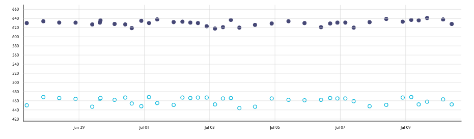
In this graph, the Y axis is the geometric mean time to render the about:home Top Sites over 20 restarts of the browser, in milliseconds. Lower is better. The dots along the top are without the cache. The dots along the bottom are with the cache enabled. According to our measurements, we improved the rendering time from process start to Top Sites by just over 20%! We beat our prototype!
Noticeable differences
But the real proof will be if there’s actually a noticeable visual change. Here’s that screen recording again from one of our reference devices8.
The screen on the left is with the cache disabled, and on the right with the cache enabled. Looks to me like we made a noticeable dent!
Try it out!
We haven’t yet enabled the about:home startup cache in Nightly by default, but we hope to do so soon. In the meantime, Nightly users can try it out right now by going to about:preferences#experimental and toggling it on. If you find problems and have a Bugzilla account, here’s a form for submitting bugs to the right place.
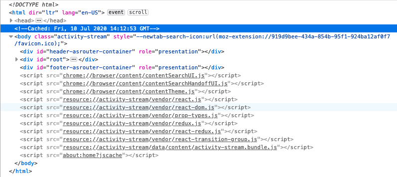
You can tell if the about:home you’re looking at is from the cache by opening up the DevTools Inspector and looking for a <!-- Cached: <some date> --> comment just above the <body> tag.
Caveat emptor
There are a few cases where the cache isn’t used or is invalidated.
The first case is if you’ve configured something other than about:home as your home page (where the cache isn’t used). In this case, the cache won’t be read from, and the code to create the cache won’t ever run. If the user ever resets about:home to be their home page, then the caching code will start working for them.
The second case is if you’ve configured Firefox to restore your previous session by default. In this case, it’s unlikely that the first tab you’ll see is about:home, so the cache won’t be read from, and the code to create the cache won’t ever run. As before, if the user switches to not loading their previous session by default, then the cache will start working for them.
Another case is when the Firefox build identifier doesn’t match the build identifier from when the cache was created. This is also how the other startupcache module for static resources works. This ensures that when an update is applied, we don’t accidentally load old assets from the cache. So the first time you launch Firefox after you apply an update will not pull the about:home document from the cache, even if one exists (and will throw the cache out if it does). For Nightly users that generally receive updated builds twice a day, this makes the cache somewhat useless. Beta and Release users update much less frequently, so we expect to see a greater impact there.
The last case is in the event that your disk was in a situation such that reading the dynamic code from the asset bundle was faster than reading from the cache. If by the time the about:home document attempts to load and the cache isn’t ready, we fall back to loading it the old way. We don’t expect this to happen too often, but it’s theoretically possible, so we handle the case.
Future work
The next major step is to get the about:home startup cache turned on by default on Nightly and get it tested by a broader audience. At that point, hopefully we’ll get a better sense of its behaviour out in the wild via bug reports and Telemetry. Then our improvement will either ride the release train, or we might turn it on for subsets of the Beta or Release populations to measure its impact on more realistic restart scenarios. Once we’re confident that it’s helping more than hindering, we’ll turn it on by default for everyone.
After that, I think it would be worth seeing if we can load from the cache more often. Perhaps we could load about:newtab from there as well, for example.
One step at a time!
Thanks to
- Florian Quèze and Doug Thayer, both of whom independently approached me with the idea of creating a static about:home
- Jay Lim and Ursula Sarracini, both of whom wrote some of the groundwork code that was needed for this feature (namely, the infrastructure for the privileged about content process, and the first version of the moz-page-thumbs support)
- Gijs Kruitbosch, Kate Hudson, Ed Lee, Scott Downe, and Gavin Suntop for all of the consulting and reviews
- Honza Bambas and Andrew Sutherland for storage consultations
- Markus Stange, Andrew Creskey, Eric Smyth, Asif Youssuff, Dan Mosedale, Emily Derr for their generous feedback on this post
This is only true if the user hasn’t just restarted after applying an update, and if they haven’t set a custom home page or configured Firefox to restore their previous session on start. ↩
You can think of startup like a traveling circus coming to town. You have to get the trucks and trailers parked, get the tents set up, hook up power, then lighting and sound … it’s a big, complex operation, and we haven’t even shot a clown out of a cannon yet. ↩
As the user browses, bookmarks and downloads things, their Highlights and Top Sites sections might change. If Pocket is enabled, new stories will also be downloaded periodically. ↩
It’s vitally important that content processes have limited abilities. That way, if they’re ever compromised by a bad actor, there are limits to what damage they can do. The assertions mentioned in this case mean that if a compromised content process tries to “pretend” to be the privileged about content process by sending one of its messages, that the parent process will terminate that content process immediately. ↩
Naming is hard. ↩
This has changed slightly in the past few years with a feature called Race Cache With Network, which races the disk cache with the network instead of relying on the disk entirely. ↩
This device is an Acer Aspire E-15 E5-575-33BM ↩