Another new thing that came out with Firefox 29 is a sexy new customization interface. We wanted to make UI customization something that anybody would feel comfortable doing, instead of something only a few mighty power users might do.
The new customization mode is accessible by pressing the Menu Button (☰), and then clicking Customize.
Give it a shot now if you’ve never done it.
BAM, did you see that? What you just saw was a full-on mode switch in the browser chrome to indicate to you that you’ve put the browser into a different state – specifically, a state where much of the browser UI is malleable. You can drag and drop things in your toolbars and the menu, enable toolbars, etc.
Going in and out of customization mode is not something that most people will do frequently, but we still invested a bunch of time trying to make it smooth. I still think there is more we can do on that front, and I’ll get into that at the end of this post.
Anyhow, as with any performance-related project, we started with a way of measuring. In this case, our trusty performance team re-purposed the TART test that we used for tab animation, and pointed it at the customize mode transition. We called this new test CART (customization animation regression test, natch).
This is slightly different from the tab animation stuff, because we didn’t really have a baseline measurement to compare against – there was no old customization mode transition to try to match or beat. So we just had to do our best to do all of our processing under 16ms in order to draw the transition at 60fps.
That means that instead of comparing two sets of data over time, we’ll only be looking at a single series of points, and how they change over time.
So let’s see where we started, and where we finished, and how we got there.
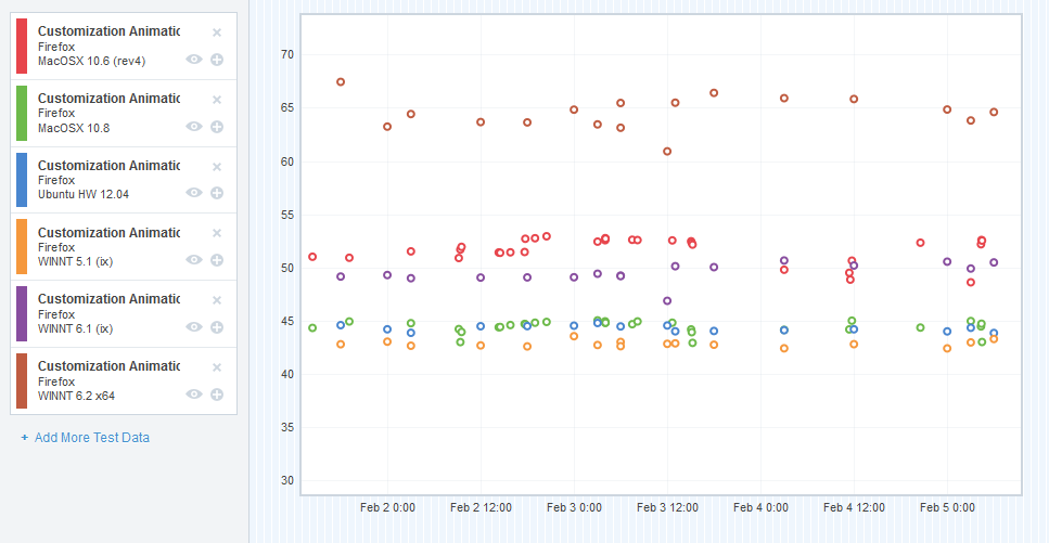
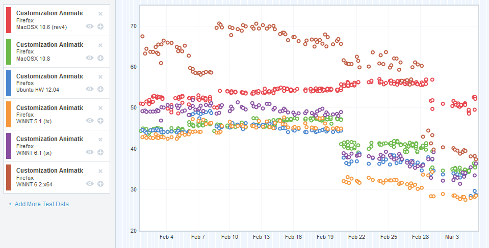
So in an effort to get this blog post done, I’ve cut some corners and combined the data from a number of different platforms into a single graph. I apologize if this makes it difficult to interpret for some of you – but I’ll do my best to explain what the graph means.
I chose a representative sample of the platforms that we measured – we’ve got OS X (10.6, 10.8), Ubuntu 12.04 (32-bit), Windows XP, Windows 7, and Windows 8.
The X-axis is obviously plotting the time (we started gathering CART data right at the end of January 2014). The Y-axis plots the “final CART value”. CART, like TART, measures a number of things, and we “boil that number down” into a single value that we can plot. Each of the subtests are measured in milliseconds, so I guess you could say the Y-axis is also in milliseconds – but as it’s an aggregate, that’s not too meaningful. It’s not the greatest for detecting small shifts in the subtests (we use Datazilla for that), but it allows me to illustrate the changes over time in a pretty simple way.
So it looks like my sampled platforms are all floating around the 40’s and 50’s. Is that good or bad? Well, it’s neither really. It’s just our starting point, and we wanted to try to improve on that.
And so we set out trying to move those dots downwards (for this data, without going into grand detail, lower milliseconds = faster and smoother animation).
As with TART, we did a lot of profiling, and used a lot of the tools I mentioned in this post. Here are the bugs that seemed to move the needle the most.
The Rogue’s Gallery
As before, this is not a complete list, but captures some of the more interesting bugs we worked on.
Bug 932963 – Break customize mode transition into several phases
This change allowed us to break the transition in and out of customization mode into some phases:
- Not in customization mode (default)
- Entering customization mode
- Entered customization mode
- Exiting customization mode
Phases 2, 3 and 4 have attributes on the main browser window that we can target with CSS selectors. We were then able to “lighten” the CSS during phases 2 and 4, in order to optimize the frames during the transition. For example, we don’t display the semi-transparent grid texture on the main window unless we’re in phase 3.
Bug 972485 – Find out why we’re doing a bunch of synchronous file reading at the start of the customize mode transition
This was a rather surprising one – using the Gecko Profiler, it looked like we were doing sync file IO as the blank about:customizing document was loading.
For context, we have a page registered at about:customizing that’s a blank document. When we detect that about:customizing has been loaded or switched to, we enter customize mode.
So this sync file IO was causing some jank at the start of the customization mode transition.
Strangely, it turned out that the XHTML file we were loading for the blank about:customizing document was synchronously loading a bunch of MathML localization stuff as it loaded.
We switched the document from XHTML to XUL, and the sync IO load went away. We filed a follow-up bug to investigate why exactly we were doing sync file IO on loading XHTML files, because that’s a bad thing to do.
Anyhow, this was a small but significant win for almost all platforms.
Bug 975552 – Preload about:customizing like we do with about:newtab
I think this was the biggest win we achieved during the performance work. That browser that we load the blank about:customizing page in is not free – a bunch of stuff gets instantiated in order for a working browser to be created, and all of that expense is wasted on a blank document. That expense also causes enough main thread thinking that it reduces the smoothness of the customization entering transition.
So the solution was a hack that takes after the same strategy we use for about:newtab. Essentially, we preload the about:customizing browser and document in the background at what seems like a logical time (right after the user has opened the menu). This allows us to front-load all of the expense in creating the browser, and we end up with something much smoother.
Here’s a before video and an after video from my Windows 7 machine, for reference.
This was a pretty bodacious hack, and in the future, I’d like to remove it completely, and find some way of sidestepping all of the browser internal loading for the about:customizing document (or, even better, find a way of not using a browser element at all!). That’s filed here.
Bug 977796 – Disable subpixel anti-aliasing during customize mode transition.
A profile on Windows 8 showed that we were spending an inordinate amount of time rendering text during the customize mode transition, and this has to do with subpixel anti-aliasing in the menu that animates in.
So I landed a patch that temporarily disables subpixel anti-aliasing on that element during the customize mode transition, and that bought us a huge win for Window 8 (about 20%). Not much of a win for any of the other platforms.
So where did we end up?
Those numbers are indeed lower!
Now, before you lose your mind about that epic cross-platform win around Feburary 20th, I investigated that changeset range and didn’t find anything we worked on directly in there.
There are some platform patches in there (specifically in Graphics) that might account for this win, but I’m pretty certain it’s because of bug 974621, which updated our test runners to use a different version of Talos that included the patch in bug 967186. 967186 altered the CART test to be more accurate in its measurements, so actually a lot of our initial data was erroneous. That blows a bit because it adds some unnecessary noise to our graph, but it’s also good because accuracy is a thing we definitely want.
Future work
I still think there’s more wins to be made in the customize mode transition. Finding a way of getting rid of the about:customizing preloading hack and replace it with something smarter (like a thin browser that doesn’t need to instantiate much of its backend, or no browser at all) is probably the first step. More profiling might find more wins. I’m learning more and more about platform as I work on Electrolysis, so maybe I’ll come back to this problem with some new skills and information, and I can get it performing reliably on all platforms as it really should: 60fps, smooth as silk.


Great work Mike. You can really feel the difference between what it was a couple of months ago and how much smoother it is now.
One quick note though. When you enter customisation mode, the bookmark toolbar eventually gets blanked out and replaced with “bookmark toolbar items”. If that could happen earlier in the process, you could reduce a bit reflow that occurs within the toolbar.
Thanks! Glad you can feel the difference – makes the whole effort worth it when I hear that stuff. 🙂
Right now, that “Bookmarks Toolbar Items” thing is the result of us wrapping all customizable items in a new node in order to make them drag and droppable. That way, we can intercept click / drag events on them, without some addon-supplied widget wigging out and doing something unexpected.
We tinkered a little bit with the timing of when we do the wrapping. Right now, thanks to bug 881909, that occurs after the transition has finished.
But you’re right – this does introduce some additional movement after the customization mode transition is supposed to be done. What’d really probably be best is if we didn’t restyle the Bookmarks Toolbar Items element at all – make it appear the same as it does in the normal mode, just disabled.