Tag Archives: wireframe

Update to my address book mock-up

Update: I also added “instant” style searching a few minutes ago. I thought it was cool enough that I’d update my mock-up right away.

Thanks so much for the great feedback this past week for my initial mock-up!

Today, I’ve decided to zoom in a little bit, and try to make some adjustments to the contact list, the category selector, and the search input.

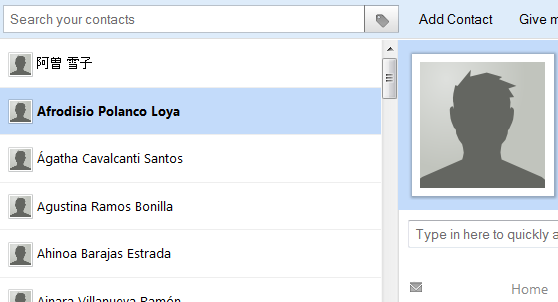
The contact search, category selector, and list have been updated.


Here’s a list of the things I’ve changed, in no particular order:

  • “Instant” style searching.
  • Names in the contact list are not bold unless selected
  • The contact list is wider
  • Names in the contact list are sorted alphabetically – regardless of accents. Accents are ignored.
  • I’m using pinyin.js to help me sort the Japanese names. Hopefully the order they’re in makes some sense.
  • The category selector toggle now exists outside (but adjacent to) the search input. It’s the grey button with the “tag” icon.
  • Choosing a category puts the search query for that category into the search input, and then focuses the search input.
  • Searching within a category is now possible, with searches like: “tag:clients guertin”
  • The “Add X” items from the contact details view have been removed. I’ve got something less noisy in mind now – I’ll focus on that soon.

I got a lot of feedback about sorting during my last iteration. It sounds like sorting contacts is something people want to be able to do.

I’m curious if that’s true, and why sorting is so important. So I’ve updated my feedback form to hopefully give me some insight.

Note: If you used the old mock-up, you might need to flush your cache to view the changes. Press and hold SHIFT while reloading to flush your cache.

Another note: The same disclaimer about code quality and browser compatibility still applies.

Enough already, here’s the link to the updated mock-up.

And here’s a direct link to the feedback form.
 

A glimpse of a new address book for Thunderbird

I’ve been working on a new address book for Thunderbird.

And I’m making progress.

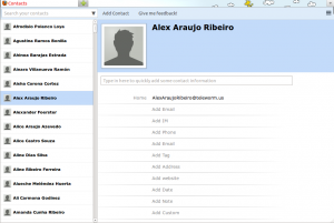
I’ve reached a point where I feel like the back-end can do something useful, and I want to start worrying about how the front-end works and feels and functions.

Now I’ve got a web-based super-early prototype for you to try.

A screenshot of the mockup in my Firefox browser.

Some caveats:

  1. Bear in mind this thing is super early, and super incomplete.
  2. The primary goal of this version of the prototype is to determine if the general layout makes sense
  3. Adding contacts, and adding new fields to existing contacts does not work
  4. Expect hacky hacky crap code if you look inside the mockup. Here there be monsters.
  5. The menu button in the right-top corner does not work
  6. I’ve only tested / developed in Firefox. Other browsers are not supported, and I don’t plan to sweat about it too much.

Wow, so it sounds like this thing doesn’t do a whole lot. So what does it do?

  1. It loads a list of 500 fake contacts for you to browse through.
  2. It allows you to see the email addresses for each contact that has an email address
  3. Simple searching works
  4. Different contact categories can be viewed
  5. Gives you a sense of how the layout would be. Hide Firefox’s navigation bar for bonus points!

There’s also a big fat FEEDBACK button at the top of the mock. Please give me feedback. Or click here to go to the form directly. Am I heading in the right direction?

Here’s the link to the mock-up. Give it a whirl!

And here’s the Github repository if you want to cry while reading my crappy mockup code.

Expect more of these.