I wrote a while back about how Matt, Avi Halachmi and I have been ironing out performance problems with the Australis curvy tabs.
Well, it looks like that work is finally paying off.
Our SVG usage seemed to be the big slow-poke, and switching to PNGs gave us the boost that we needed.
But enough squawking, let’s see some charts.
Before Optimizations
Let’s compare – here’s a chart showing the difference between pre-curves and post-curves, before our optimizations:
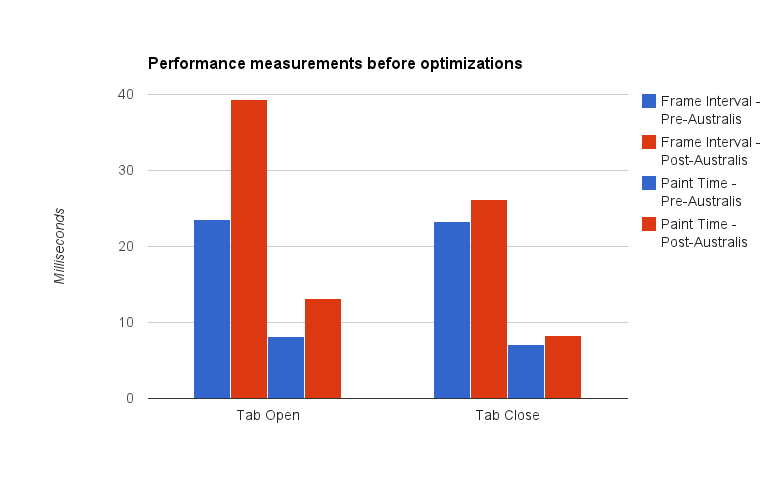
Here’s the before shot
Note: it’s been a while since I’ve done data visualization work. I think the last time I did this was in grad school. So there might be way better ways of visualizing this data, but I just chose the easiest chart I could manage with Google Docs. Just go with it.
Let me describe what you’re seeing here – we take samples every time a tab opens, and every time a tab closes*. What we’re measuring is the interval time (how long it takes before we start drawing the next frame), and the paint time (how long it takes to actually draw a frame).
The blue bars represent the performance measurements we took on a build using the default theme. The red bars represent the performance measurements we took using the Australis curvy tabs.
This is where my graph could probably be clearer – in each group of four bars, the left two represent interval times, and the right two represent paint times.
So, hand-wavey interpretation – we regressed in terms of performance in both painting, and frame intervals, for tab opening and closing.
So that’s what we started with. And then we did our optimizations. So where did we get to?
After Optimizations
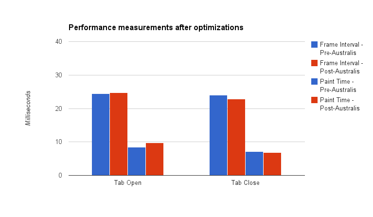
Here’s the after shot!
The red bars shrunk, meaning that we got faster for both interval and paint times. In fact, for tab close, we beat the old theme! And we’re really super-close for tab open.
Pretty good!
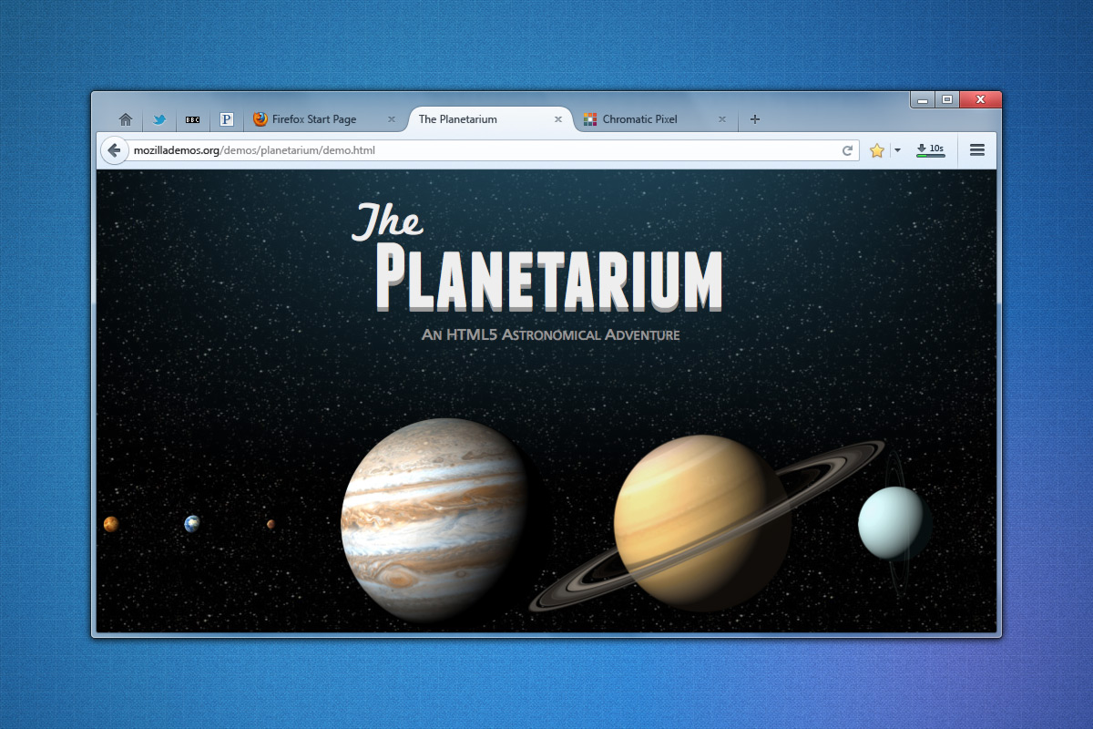
Curvy tabs for all
Last night, Matt landed our optimization patches, as well as preliminary curvy tab work for OSX* and Linux GTK on our UX branch. So, if you’re on the UX branch (and why aren’t you?), you should be receiving a build soon with some curvy tabs. They’re not perfect, not by a long shot, but we’re getting into the polish stage now, which is good.
* Some notes on our measuring methodology. All tests were performed on a low-powered Acer Aspire One netbook. Intel Atom n450 processor (1.66Ghz), 1GB of RAM, running Windows 7. The device has no graphics acceleration support. We also switched to the classic theme to avoid glass. Avi wrote a patch that opened and closed a tab 15 times, and averaging the frame intervals and paint times for each frame. Those were averaged over the 15 openings and closings. We then ran that test 4 times, giving the machine time to “relax” in between, and averaged our results.
* We don’t have hi-dpi support yet, so if you’re on a Mac with a Retina display, your curves might be fuzzy. We’re working on it.