Tag Archives: data

Australis Curvy Tabs: More Progress!

I wrote a while back about how Matt, Avi Halachmi and I have been ironing out performance problems with the Australis curvy tabs.

Well, it looks like that work is finally paying off.

Our SVG usage seemed to be the big slow-poke, and switching to PNGs gave us the boost that we needed.

But enough squawking, let’s see some charts.

Before Optimizations

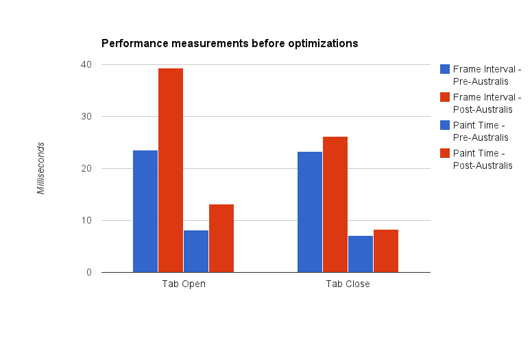
Let’s compare – here’s a chart showing the difference between pre-curves and post-curves, before our optimizations:

A graph showing Australis curves performance measurements before optimizations

Here’s the before shot

Note: it’s been a while since I’ve done data visualization work. I think the last time I did this was in grad school. So there might be way better ways of visualizing this data, but I just chose the easiest chart I could manage with Google Docs. Just go with it.

Let me describe what you’re seeing here – we take samples every time a tab opens, and every time a tab closes*. What we’re measuring is the interval time (how long it takes before we start drawing the next frame), and the paint time (how long it takes to actually draw a frame).

The blue bars represent the performance measurements we took on a build using the default theme.  The red bars represent the performance measurements we took using the Australis curvy tabs.

This is where my graph could probably be clearer – in each group of four bars, the left two represent interval times, and the right two represent paint times.

So, hand-wavey interpretation – we regressed in terms of performance in both painting, and frame intervals, for tab opening and closing.

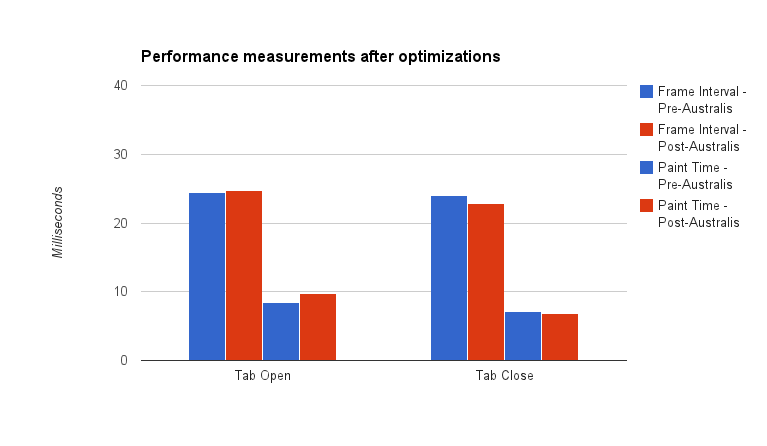
So that’s what we started with. And then we did our optimizations. So where did we get to?

After Optimizations

A graph showing Australis curves performance measurements after optimizations

Here’s the after shot!

The red bars shrunk, meaning that we got faster for both interval and paint times. In fact, for tab close, we beat the old theme! And we’re really super-close for tab open.

Pretty good!

Curvy tabs for all

Last night, Matt landed our optimization patches, as well as preliminary curvy tab work for OSX* and Linux GTK on our UX branch. So, if you’re on the UX branch (and why aren’t you?), you should be receiving a build soon with some curvy tabs. They’re not perfect, not by a long shot, but we’re getting into the polish stage now, which is good.

* Some notes on our measuring methodology. All tests were performed on a low-powered Acer Aspire One netbook. Intel Atom n450 processor (1.66Ghz), 1GB of RAM, running Windows 7. The device has no graphics acceleration support. We also switched to the classic theme to avoid glass. Avi wrote a patch that opened and closed a tab 15 times, and averaging the frame intervals and paint times for each frame. Those were averaged over the 15 openings and closings. We then ran that test 4 times, giving the machine time to “relax” in between, and averaged our results.

* We don’t have hi-dpi support yet, so if you’re on a Mac with a Retina display, your curves might be fuzzy. We’re working on it.

Whoops – I forgot I was a scientist

So yesterday I posted some mock-ups for a new Thunderbird address book design, and I got a bunch of really awesome, useful feedback.

Probably what rang out loudest for me was that I don’t really have any data on how real users actually use Thunderbird’s address book.  I know how I use it, but that’s about it.  In fact, I talked a Thunderbird user the other day who didn’t even know that the Thunderbird address book existed.  Go figure.

And here I went and jumped the gun, and tossed together some mock-ups.

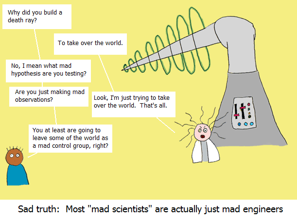
If there’s anything that my grad supervisor Greg Wilson taught me, it’s not to jump to conclusions (or mock-ups) when we don’t have any data to back it up.  I’m a scientist, damn it, and that’s just how we roll.

Credit: http://cowbirdsinlove.com/46


Firefox has this great add-on called Test Pilot that lets Firefox users volunteer to have data periodically collected from them.  Work to get Test Pilot working for Thunderbird is underway, and I think that’d be an awesome tool for gathering feedback about how users use the address book.

Some questions I’d want answered, right off the top of my dome, in no particular order:

  1. Does anybody actually use Thunderbird’s address book?
  2. When someone is using the address book, what are they likely doing?
    1. Looking for a contact?
    2. Sorting and organizing their contacts?
    3. Creating or editing contacts?
    4. Other?
  3. Do people use mailing lists?  If so, how many do they tend to have?
  4. How many address books do people tend to have?
  5. How many address books do people want to have?
  6. How many contacts to people tend to have in their address books?
  7. Is it important for people to be able to group their contacts into sets, like “Family”, “Friends”, “Acquaintances”, “Employees”, “Co-workers”, etc?
  8. Given several address books, where each address book has some large number of contacts, how quickly can an individual contact be found?
  9. How much switching back and forth from mouse and keyboard is required to create a new contact, or to edit an old contact?
  10. How important is it for Thunderbird’s contacts to be synchronized with other contact services, like Google Contacts or the OSX address book?
    1. Or is it sufficient just to import them?
  11. How important is it for Thunderbird’s contacts to be synchronized with user’s mobile devices?
  12. On average, how long does it take to create a new contact?
  13. On average, how long does it take to edit a contact?
  14. On average, how much time are users spending in the address book?
  15. What fields do most users want to associate with a contact?
  16. What are the top 10 complaints about Thunderbird’s address book?
  17. What are the top 10 best things about Thunderbird’s address book?

What are some other questions I should try to get answered?

UPDATE (Aug 29 – 10:00EST)

I’ve gotten some awesome feedback on this post, and some new questions to add to my list.  Here they are, in no particular order:

  1. What is the main way in which Thunderbird users use and manipulate their address books?
    1. Through the main address book interface
    2. Through the contacts sidebar in the compose window
    3. Through the inline contact editor within a message header
    4. Other?
  2. If the answer to the above is anything other than 1, is it possible that the address book manager is not needed?  Or does not need to be as complicated as it already is?
  3. How many duplicate contacts does the average user possess (where a duplicate contact is a contact with the same e-mail address, or possibly the same name)
  4. How frustrating is it to add a contact in Thunderbird?
  5. How frustrating is it to edit a contact in Thunderbird?
  6. How frustrating is it to search for a contact in Thunderbird?
  7. How often do users want to create a contact based on a pre-existing one?  Example – creating co-workers, with similar fields for work addresses, etc, but different names, phones, etc.

MoMo All-Hands: Day 3 (Data-Driven, Don’t Be Creepy, Italian-Chinese Dinner, Hipster-slamming)

At around 7:30AM, I rolled out of bed, cleaned myself up, and headed down to breakfast.

Breakfast that day was similar to the day before:  yogurt and granola.  Coffee and juice.  The cakes, however, had gotten the axe, and had been replaced by scones.

Very tasty.  A bunch of us ate breakfast out on the meeting room patio.  Once again, it was a gorgeous morning.

After breakfast, we all went inside to talk about data. Specifically, that we aim to be data-driven.  This means that if we’re making a big decision about Thunderbird, or any of the other stuff we’re working on, we should probably have some solid data to back up those decisions.  It’s a good idea; the road to bad design is paved with good intentions, and lack of data.

But how exactly are we going to get this data?  Are we simply going to monitor our users without their knowledge, like Big Brother, and study them like lab rats?  Are we going to collect reams of data about them secretly and silently in the background, without telling our users or giving them a choice?

Of course not, because that’d be evil.  And creepy.  Don’t track me, bro.

Instead, we will always ask the user if they’re interested in submitting data for study.  In general, our data collection is opt-in – and instead of tracking individuals, we aggregate the data, so that we never have a single person as a data point.  Nice.

A lot of ideas got tossed around about how we can ask the users for data, and what type of data we were interested in.  Some very interesting discussions took place regarding the Thunderbird “funnel” (the action path from visiting the Mozilla Thunderbird website, to downloading TB, to installing TB, to running TB, to making TB something commonly used).  Our funnel is pretty wide, but some website tweaks might make it even wider.  I’m excited to hear more about it.

After that, lunch.  Roasted chicken, mashed potatoes, veggies…once again, very tasty.  Cake for dessert.  We were getting pretty spoiled.

Following lunch, a bunch of us went outside to hear Andrew Sutherland talk about Wmsy – his constraint-based widgeting framework.  This was one of the talks that took place out on the patio, and the sun was blazing.  Much sunscreen had to go on, and I wish I’d brought sunglasses, because the image of the giant yellow pads of paper-on-easels that Andrew was drawing on was slowly being burnt into my retinas.  And then, sunscreen started getting into my eyes.  And yet, despite the blazing heat, the blinding sun, and the burning chemicals in my eyes, I was able to get a lot out of the talk.  Wmsy is pretty cool, and you should check it out.

After that, we went inside, and there was a bunch of GSoC talk.  Mentors talked about how it was working with GSoC students, and what kind of GSoC students we’d be looking for.  Then, a big brainstorm happened where we came up with potential GSoC projects.

[simage=767,288]

As a former GSoC student, I have to say, it’s a really worthwhile program.  I had an awesome summer doing GSoC.  Highly recommended.  Thumbs up, Google.

After that, the meetings were over.  I headed upstairs to talk to my parents and Emily on Skype for a bit, and then headed down to the lobby for dinner.  A group of us were eating at “Chow Mein”, an Italian-Chinese fusion restaurant.

It was pretty good. Fettuccine on one side of my plate, barbecue pork fried rice on the other, and some salad…a delicious and eclectic meal.  As an added bonus, while refilling our glasses, our waiter told us in excruciating detail about how he got pulled over for DUI on his birthday.  On that note, we had a fantastic dessert, and then left.

The sun was down, and we walked slowly along the beach back towards the hotel.  We stopped off at the beach-side patio to hang out a bit first.

[simage=766,288]

We raced Mai Tai umbrellas, and trash-talked hipsters.  It was probably the most hipster thing I did in Hawaii.

And speaking of hipsters (mildly NSFW):

Eventually, I made it back to my hotel room, and fell asleep.

Some More Results: Did the Graders Agree? – Part 2

(Click here to read the first part of the story)

I’m just going to come right out and say it:  I’m no stats buff.

Actually, maybe that’s giving myself too much credit.  I barely scraped through my compulsory statistics course.  In my defense, the teaching was abysmal, and the class average was in the sewer the entire time.

So, unfortunately, I don’t have the statistical chops that a real scientist should.

But, today, I learned a new trick.

Pearson’s Correlation Co-efficient

Joorden’s and Pare gave me the idea while I was reviewing their paper for the Related Work section of my thesis.  They used it in order to inspect mark agreement between their expert markers.

In my last post on Grader agreement, I was looking at mark agreement at the equivalence level.  Pearson’s Correlation Co-efficient should (I think) let me inspect mark agreement at the “shape” level.

And by shape level, I mean this:  if Grader 1 gives a high mark for a participant, then Grader 2 gives a high mark.  If Grader 1 gives a low mark for the next participant, then Grader 2 gives a low mark.  These high and low marks might not be equal, but the basic shape of the thing is there.

And this page, with it’s useful table, tell me how I can tell if the correlation co-efficient that I find is significant.  Awesome.

At least, that’s my interpretation of Pearson’s Correlation Co-efficient.  Maybe I’ve got it wrong.  Please let me know if I do.

Anyhow, it can’t hurt to look at some more tables.  Let’s do that.

About these tables…

Like my previous post on graders, I’ve organized my data into two tables – one for each assignment.

Each table has a row for that assignments criteria.

Each table has two columns – the first is strictly to list the assignment criteria.  The second column gives the Pearson Correlation Co-efficient for each criterion.  The correlation measurement is between the marks that my two Graders gave on that criterion across all 30 submissions for that assignment.

I hope that makes sense.

Anyways, here goes…

Da-ta!

Decks and Cards Grader Correlation Table

[table id=8 /]

Flights and Passengers Grader Correlation Table

[table id=9 /]

What does this tell us?

Well, first off, remember that for each assignment, for each criterion, there were 30 submissions.

So N = 30.

In order to determine if the correlation co-efficients are significant, we look at this table, and find N – 2 down the left hand side:

28                       .306    .361    .423    .463

Those 4 values on the right are the critical values that we want to pass for significance.

Good news!  All of the correlation co-efficients fall within the range of [.306, .463].  So now, I’ll show you their significance by level:

p < 0.10

  • Design of __str__ in Decks and Cards assignment

p < 0.05

  • Design of deal method in Decks and Cards assignment

p < 0.02

  • Design of heaviest_passenger method in Flights and Passengers

p < 0.01

Decks and Cards
  • Design of Deck constructor
  • Style
  • Internal Comments
  • __str__ method correctness
  • deal method correctness
  • Deck constructor correctness
  • Docstrings
  • shuffle method correctness
  • Design of shuffle method
  • Design of cut method
  • cut method correctness
  • Error checking
Flights and Passengers
  • Design of __str__ method
  • Design of lightest_passenger method
  • Style
  • Design of Flight constructor
  • Internal comments
  • Design of add_passenger method
  • __str__ method correctness
  • Error checking
  • heaviest_passenger method correctness
  • Docstrings
  • lightest_passenger method correctness
  • Flight constructor correctness
  • add_passenger method correctness

Wow!

Correlation of Mark Totals

Joorden’s and Pare ran their correlation statistics on assignments that were marked on a scale from 1 to 10.  I can do the same type of analysis by simply running Pearson’s on the totals for each participant by each Grader.

Drum roll, please…

Decks and Cards

p(28) = 0.89, p < 0.01

Flights and Passengers

p(28) = 0.92, p < 0.01

Awesome!

Summary / Conclusion

I already showed before that my two Graders rarely agreed mark for mark, and that one Grader tended to give higher marks than the other.

The analysis with Pearson’s correlation co-efficient seems to suggest that, while there isn’t one-to-one agreement, there is certainly a significant correlation – with the majority of the criteria having a correlation with p < 0.01!

The total marks also show a very strong, significant, positive correlation.

Ok, so that’s the conclusion here:  the Graders marks do not match, but show moderate to high positive correlation to a significant degree.

How’s My Stats?

Did I screw up somewhere?  Am I making fallacious claims?  Let me know – post a comment!

Smart Bear, Cisco, and the Largest Study on Code Review Ever

In 2006, Smart Bear software teamed up with the MeetingPlace development group at Cisco Systems, and over 10 months, produced the “largest-ever case study of its kind” on a “light-weight code review process”.

The results of the study can be found in the free book “Best Kept Secrets of Peer Code Review”.

They can also be found in one of the sample chapters that they’ve put on the site.  You can read the study right here, if you’re interested.

Here are my thoughts on the chapter…

First of all, my guard is up a bit. This all seems a bit like a sales pitch, since the software that Cisco ends up using is Smart Bear’s own Code Collaborator. I’m reading the first paragraph, and already I know how it ends – “everybody is happy, the software is improved dramatically, so you should buy Code Collaborator”. Something like that. I’ll be happy when I see some solid data, some numbers, some graphs…

Ok, I’m in at page 54 – they’re talking about how data was collected, and how they pared it down to get the most meaningful results.  This is good.  This sounds like science, and not a sales pitch.  Nice.

The next thing the study talks about is the rate that lines of code (LOC) are analyzed at – the LOC inspection rate.  The data they’ve collected shows no discernible 1-1 correlation between the LOC inspection rate, and the amount of code to inspect.  There were rare exceptions where a reviewer would seem to have such a correlation, but these reviewers tended to be novices who had not participated in many reviews before.  Analyzing the LOC inspection rates by code authors (those who are having their code reviewed) also failed to show any correlations.  In fact, there were several cases where separate reviewers took widely varied amounts of time on the same chunk of code under review.

So this leaves us with no clear answer on what factors play a part in LOC inspection rate.

The study then begins to discuss the effectiveness of the reviews, and whether or not slow reviews reveal more “defects” (where a defect is defined as any change to the code that wouldn’t have happened without the review). Because defect data from the Code Collaborator database was not considered wholly reliable (see pages 62 and 63 if you want to know why), 300 reviews were randomly plucked from the original 2500, and the discussions in each one were analyzed to gather the defect statistics.

The study then introduces the concept of “defect density”, which is a ratio of the number of defects detected per 1000 lines of code (referred to henceforth as kLOC).

I’ll skip right to some results:

Our reviews had an average 32 defects per 1000 lines of code.  61% of the reviews uncovered no defects; of the others the defect density ranged evenly between 10 and 130 defects per kLOC.

I’m surprised that 61% of the reviews found no defects.  That’s remarkably high, in my opinion.  True, it’s only a sample of 300 reviews, but still, my instincts were expecting a significantly lower number.

An even more interesting result, is that defects found (and therefore, review effectiveness) dropped off for large amounts of code to review.  The study notes that:

Anything below 200 lines produces a relatively high rate of defects, often several times the average.

So there seems to be a sweet spot.  I wonder if this is a factor in what was causing the surprising high number of defect-less reviews in that sample of 300.  Perhaps many of those reviews were for large sections of code.  Or perhaps they’re for reviews that involve only a single line of code.  The study doesn’t go into this.

What the study does go into, is a general guideline for limiting the time that code reviews take.  Their study noted a stark dropoff in review effectiveness after about an hour.  Totally understandable – I think an hour reviewing someone else’s code would probably be my limit before I started getting distracted.

The study then goes on to suggest that the “slower is better” approach to reviewing code is the right idea:

Reviewers slower than 400 lines per hour were above average in their ability to uncover defects. But when faster than 450 lines/hour the defect density is below average in 87% of the cases.

So already there are some guidelines: try to review something around 200 LOC, take your time, but don’t go over an hour.  This is useful information.

The study then goes into a test of a slight modification of how reviews are performed: before submitting code for review, the author should annotate the code, describing how the changes are structured, why they were coded the way they were coded, etc.  This has a dual-benefit:  it gives reviewers some clues at how to look at the code (while, hopefully, maintaining the distance they need to do a good job), and it also has the added benefit of getting the author to go over their code again to weed out obvious defects.

So, some reviews were carried out in this fashion.  Here’s what they found:

First, for all reviews with at least one author preparation comment, defects density is never over 30; in fact the most common case is for there to be no defects at all! Second, reviews without author preparation comments are all over the map [in terms of defect density] whereas author-prepared reviews do not share that variability.

The study gives two possible conclusions for these results:

  1. Authors gave their code such a thorough look while annotating them, that most defects were eliminated right off the bat.  I’m…skeptical of this conclusion.
  2. Since authors were explaining, or defending their changes, this sabotaged the reviewers ability to do their job effectively.

I find myself believing the second conclusion more, simply from experience:  if somebody is guiding me through things, suddenly I’m in the passenger seat, and I’m less inclined to disagree with a change if their explanation or defense sounds solid.

However, Smart Bear disagrees:

A survey of the reviews in question show the author is being conscientious,  careful, and helpful, and not misleading the reviewer. Often the reviewer will respond or ask a question or open a conversation on
another line of code, demonstrating that he was not dulled by the author’s annotations.

…we believe that requiring preparation will cause anyone to be more careful, rethink their logic, and write better code overall.

I’d like to see their data on this.  In particular, I’d like to see how often reviewers detected defects in lines of code that the author had annotated.  Unfortunately, this data is not provided in the study.

In the last few pages, the study notes that while review size has a detrimental impact on defect density (the number of defects reviewers found per kLOC), there seemed to be a fixed rate on the number of defects found per hour.  While this seems at odds with the original discovery that smaller reviews are more effective, they note:

Although the smaller reviews afforded a few especially high rates, 94% of all reviews had a defect rate under 20 defects per hour regardless of review size.

…the take-home point from Figure 22 is that defect rate is constant across all the reviews regardless of external factors.

So, assume that a reviewer has a steady defect detection rate, but that this rate drops off after about an hour.  Given a small section of code, of course the number of defects detected will be high.  And given a large chunk of code, of course the defects will be more spread out.

It’s the steady defect detection rate that bothers me – you would imagine that the detection rate would depend on the quality of the code and also on the experience of the reviewer.  But I guess, according to this study,  it doesn’t.

And so, the study goes into its conclusions.  I can’t really do much better summarizing the first conclusions for you than they did, so I’ll just regurgitate:

  • LOC under review should be under 200, not to exceed 400. Anything larger overwhelms reviewers and defects are not uncovered.
  • Inspection rates less than 300 LOC/hour result in best defect detection. Rates under 500 are still good; expect to miss significant percentage of defects if faster than that.
  • Authors who prepare the review with annotations and
  • explanations have far fewer defects than those that do not.  We presume the cause to be that authors are forced to self-review the code.
  • Total review time should be less than 60 minutes, not ex- ceed 90. Defect detection rates plummet after that time.
  • Expect defect rates around 15 per hour. Can be higher only with less than 175 LOC under review.
  • Left to their own devices, reviewers’ inspection rate will vary widely, even with similar authors, reviewers, files, and size of the review.

Given these factors, the single best piece of advice we can give is to review between 100 and 300 lines of code at a time and spend 30-60 minutes to review it.  Smaller changes can take less time, but always spend at least 5 minutes, even on a single line of code.

The study then goes into the differences in effectiveness between heavy-duty Fagan-esque code reviews, and the lightweight style of code review that took place at Cisco.  While some of their results from their study exactly match results from studies on heavyweight code reviews (time to spend on a review, when effectiveness drops off), there were some stark differences too.

For example, in the lightweight study, defect detection rate using Smart Bear was 7 times faster than the average rate found across four studies of traditional code review methods.  Sounds like we’re getting into that sales-pitch part…

The study then admits that there was no experiment control – reviews using heavyweight techniques weren’t carried out in parallel with the Code Collaborator study, so comparisons of their effectiveness on the MeetingPlace software have little-to-no data to work with.

In the end, their conclusion is that lightweight code review is just as effective as the traditional methods, while being remarkably faster to boot.  I’d like to see more evidence to back up the comparison on effectiveness, but faster seems more than plausable (Fagan inspections involve very lengthy meetings, so I’ve read).

Smart Bear agrees with my last point on effectiveness comparison, and notes that future study should be conducted where the same set of code is analyzed using both heavy and lightweight methods.

They finish it off with an invitation to software development shops to contact Smart Bear if they’d like to be involved in such a study.

So that’s the gist of it.