Author Archives: Mike Conley

DocShell in a Nutshell – Part 1: Original Intents

I think in order to truly understand what the DocShell currently is, we have to find out where the idea of creating it came from. That means going way, way back to its inception, and figuring out what its original purpose was.

So I’ve gone back, peered through various archived wiki pages, newsgroup and mailing list posts, and I think I’ve figured out that original purpose.1

The original purpose can be, I believe, summed up in a single word: embedding.

Embedding

Back in the late 90’s, sometime after the Mozilla codebase was open-sourced, it became clear to some folks that the web was “going places”. It was the “bees knees”. It was the “cat’s pajamas”. As such, it was likely that more and more desktop applications were going to need to be able to access and render web content.

The thing is, accessing and rendering web content is hard. Really hard. One does not simply write web browsing capabilities into their application from scratch hoping for the best. Heartbreak is in that direction.

Instead, the idea was that pre-existing web engines could be embedded into other applications. For example, Steam, Valve’s game distribution platform, displays a ton of web content in its user interface. All of those Steam store pages? Those are web pages! They’re using an embedded web engine in order to display that stuff.2

So making Gecko easily embeddable was, at the time, a real goal, and a real project.

nsWebShell

The problem was that embedding Gecko was painful. The top-level component that embedders needed to instantiate and communicate with was called “nsWebShell”, and it was a pretty unwieldy. Lots of internal knowledge about the internal workings of Gecko was leaked through the nsWebShell component, and it’s interface changed far too often.

It was also inefficient – the nsWebShell didn’t just represent the top-level “thing that loads web content”. Instances of nsWebShell were also used recursively for subdocuments within those documents – for example, (i)frames within a webpage. These nested nsWebShell’s formed a tree. That’s all well and good, except for the fact that there were things that the nsWebShell loaded or did that only the top-level nsWebShell really needed to load or do. So there was definitely room for some performance improvement.

In order to correct all of these issues, a plan was concocted to retire nsWebShell in favour of several new components and a slew of new interfaces. Two of those new components were nsDocShell and nsWebBrowser.

nsWebBrowser

nsWebBrowser would be the thing that embedders would drop into the applications – it would be the browser, and would do all of the loading / doing of things that only the top-level web browser needed to do.

The interface for nsWebBrowser would be minimal, just exposing enough so that an embedder could drop one into their application with little fuss, point it at a URL, set up some listeners, and watch it dance.

nsDocShell

nsDocShell would be… well, everything else that nsWebBrowser wasn’t. So that dumping ground that was nsWebShell would get dumped into nsDocShell instead. However, a number of new, logically separated interfaces would be created for nsDocShell.

Examples of those interfaces were:

  • nsIDocShell
  • nsIDocShellTreeItem
  • nsIDocShellTreeNode
  • nsIWebNavigation
  • nsIWebProgress
  • nsIBaseWindow
  • nsIScrollable
  • nsITextScroll
  • nsIContentViewerContainer
  • nsIInterfaceRequestor
  • nsIScriptGlobalObjectOwner
  • nsIRefreshURI

So instead of a gigantic, ever changing interface, you had lots of smaller interfaces, many of which could eventually be frozen over time (which is good for embedders).

These interfaces also made it possible to shield embedders from various internals of the nsDocShell component that embedders shouldn’t have to worry about.

Ok, but… what was it?

But I still haven’t answered the question – what was the DocShell at this point? What was it supposed to do now that it was created.

This ancient wiki page spells it out nicely:

This class is responsible for initiating the loading and viewing of a document.

This document also does a good job of describing what a DocShell is and does.

Basically, any time a document is to be viewed, a DocShell needs to be created to view it. We create the DocShell, and then we point that DocShell at the URL, and it does the job of kicking off communications via the network layer, and dealing with the content once it comes back.

So it’s no wonder that it was (and still is!) a dumping ground – when it comes to loading and displaying content, nsDocShell is the central nexus point of communications for all components that make that stuff happen.

I believe that was the original purpose of nsDocShell, anyhow.

And why “shell”?

This is a simple question that has been on my mind since I started this. What does the “shell” mean in nsDocShell?

Y’know, I think it’s actually a fragment left over from the embedding work, and that it really has no meaning anymore. Originally, nsWebShell was the separation point between an embedder and the Gecko web engine – so I think I can understand what “shell” means in that context – it’s the touch-point between the embedder, and the embedee.

I think nsDocShell was given the “shell” monicker because it did the job of taking over most of nsWebShell’s duties. However, since nsWebBrowser was now the touch-point between the embedder and embedee… maybe shell makes less sense. I wonder if we missed an opportunity to name nsDocShell something better.

In some ways, “shell” might make some sense because it is the separation between various documents (the root document, any sibling documents, and child documents)… but I think that’s a bit of a stretch.

But now I’m racking my brain for a better name (even though a rename is certainly not worth it at this point), and I can’t think of one.

What would you rename it, if you had the chance?

What is nsDocShell doing now?

I’m not sure what’s happened to nsDocShell over the years, and that’s the point of the next few posts in this series. I’m going to be going through the commits hitting nsDocShell from 1999 until the present day to see how nsDocShell has changed and evolved.

Hold on to your butts.

Further reading

The above was gleaned from the following sources:


  1. I’m very much prepared to be wrong about any / all of this. I’m making assertions and drawing conclusions by reading and interpreting things that other people have written about DocShell – and if the telephone game is any indication, this indirect analysis can be lossy. If I have misinterpreted, misunderstood, or completely missed the point in any of the above, please don’t hesitate to comment, and I will correct it forthwith. 

  2. They happen to be using WebKit, the same web engine that powers Safari, and (until recently) Chromium. According to this, they’re using the Chromium Embedding Framework to display this web content. There are a number of applications that embed Gecko. Firefox is the primary consumer of Gecko. Thunderbird is another obvious one – when you display HTML email, it’s using the Gecko web engine in order to lay it out and display it. WINE uses Gecko to allow Windows-binaries to browse the web. Making your web engine embeddable, however, has a development cost, and over the years, making Gecko embeddable seems to have become less of a priority. Servo is a next-generation web browser engine from Mozilla Research that aims to be embeddable. 

Alice in DocShell Land

I’ve been reading a book called The Annotated Alice. In this book, the late and great Martin Gardner shows us the stories of Alice’s Adventures in Wonderland and Through the Looking-Glass but supplies copious footnotes to illustrate the puns, wordplay, allusions, logic problems and satire going on beneath the text. Some of these footnotes delve into pure conjecture (there are still people to this day who theorize about various aspects of the stories), and other footnotes show quite clearly that Carrol wrote these stories with a sophisticated wit and whimsy that isn’t immediately obvious at first glance.

And it’s clear that Gardner (and others like him) have spent hours upon hours thinking and theorizing about these stories. A purposeful misspelling gets awarded a two page footnote here, and a mention of a mirror sends us off talking about matter and anti-matter and other matters (ha) of quantum physics.

So much thinking and effort to interpret these stories, and what you get out of it is a fascinating tapestry of ideas and history.

Needless to say, I’ve been finding the whole thing fascinating. It’s a hell of a read.

While reading it, I’ve wondered what it’d be like to apply the same practice to source code. Take some relatively mysterious piece of source code that only a few people feel comfortable with, and explode it out. Go through the source control history, and all of the old bugs, and see where this code came from. What was its purpose to begin with? What is its purpose now? What are the battle scars?

After much thinking, I’ve decided to try this, and I’m going to try it on a piece of Gecko called “DocShell”.

I think I just heard Ms2ger laughing somewhere.

It’s become pretty clear having talked to a few seasoned Mozilla hackers that DocShell is not well understood. The wiki page on it makes that even more clear – it starts:

The goal of this page is to serve as a dumping/organization ground for docshell docs. When someone finds out something, it should be added here in a reasonable way. By the time this gets unwieldy, hopefully we will have enough material for several actual docs on what docshell does and why.

So, I’m going to attempt to figure out what DocShell was supposed to do, and figure out what it currently does. I’m going to dig through source code, old bugs, and old CVS commits, back to the point where Netscape first open-sourced the Mozilla code-base.

It’s not going to be easy. It’s definitely going to be a multiple month, multiple post effort. I’m likely to get things wrong, or only partially correct. I’ll need help in those cases, so please comment.

And I might not succeed in figuring out what DocShell was supposed to do. But I’m pretty confident I can get a grasp on what it currently does.

So in the end, if I’m lucky, we’ll end up with a few things:

  1. A greater shared understanding of DocShell
  2. Materials that can be used to flesh out the DocShell wiki
  3. Better inline documentation for DocShell maybe?

I’ve also asked bz to forward me feedback requests for DocShell patches, so that way I get another angle of attack on understanding the code.

So, deep breath. Here goes. Watch this space.

Australis Performance Post-mortem Summary

Over the last few months, I’ve been talking about all of the work we put into making Australis feel fast when it shipped in Firefox 29.

I talked about where we started with our performance work, and how we grappled with the ts_paint and tpaint performance (“talos”) tests. After that, I talked a bit about the excellent tools we have (and ones we developed ourselves) to make finding our performance bottlenecks easier.

After a brief delay, I rounded out the series by talking about our tab animation performance work, and the customization transition performance work.

I think over the course of working on these things, I’ve learned quite a bit about performance work in general. If I had to distill it down to a few tidbits, it’d be:

  • Measure first to get a baseline, then try to improve. (Alternatively, “you can’t improve what you can’t measure”)
  • Finding the solutions to performance problems is usually the easy part. The hard part is finding and isolating the problems to begin with.
  • While performance work can be a bit of a grind, users do feel and appreciate the efforts. It’s totally worth it.

So that’s it on the series. Enjoy your zippy Firefox!

Australis Performance Post-mortem Part 5: The Customize Mode Transition

Another new thing that came out with Firefox 29 is a sexy new customization interface. We wanted to make UI customization something that anybody would feel comfortable doing, instead of something only a few mighty power users might do.

The new customization mode is accessible by pressing the Menu Button (☰), and then clicking Customize.

Give it a shot now if you’ve never done it.

BAM, did you see that? What you just saw was a full-on mode switch in the browser chrome to indicate to you that you’ve put the browser into a different state – specifically, a state where much of the browser UI is malleable. You can drag and drop things in your toolbars and the menu, enable toolbars, etc.

Going in and out of customization mode is not something that most people will do frequently, but we still invested a bunch of time trying to make it smooth. I still think there is more we can do on that front, and I’ll get into that at the end of this post.

Anyhow, as with any performance-related project, we started with a way of measuring. In this case, our trusty performance team re-purposed the TART test that we used for tab animation, and pointed it at the customize mode transition. We called this new test CART (customization animation regression test, natch).

This is slightly different from the tab animation stuff, because we didn’t really have a baseline measurement to compare against – there was no old customization mode transition to try to match or beat. So we just had to do our best to do all of our processing under 16ms in order to draw the transition at 60fps.

That means that instead of comparing two sets of data over time, we’ll only be looking at a single series of points, and how they change over time.

So let’s see where we started, and where we finished, and how we got there.

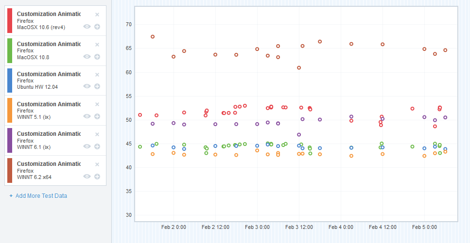
CART results - pre-optimizations

CART results – pre-optimizations

So in an effort to get this blog post done, I’ve cut some corners and combined the data from a number of different platforms into a single graph. I apologize if this makes it difficult to interpret for some of you – but I’ll do my best to explain what the graph means.

I chose a representative sample of the platforms that we measured – we’ve got OS X (10.6, 10.8), Ubuntu 12.04 (32-bit), Windows XP, Windows 7, and Windows 8.

The X-axis is obviously plotting the time (we started gathering CART data right at the end of January 2014). The Y-axis plots the “final CART value”. CART, like TART, measures a number of things, and we “boil that number down” into a single value that we can plot. Each of the subtests are measured in milliseconds, so I guess you could say the Y-axis is also in milliseconds – but as it’s an aggregate, that’s not too meaningful. It’s not the greatest for detecting small shifts in the subtests (we use Datazilla for that), but it allows me to illustrate the changes over time in a pretty simple way.

So it looks like my sampled platforms are all floating around the 40’s and 50’s. Is that good or bad? Well, it’s neither really. It’s just our starting point, and we wanted to try to improve on that.

And so we set out trying to move those dots downwards (for this data, without going into grand detail, lower milliseconds = faster and smoother animation).

As with TART, we did a lot of profiling, and used a lot of the tools I mentioned in this post. Here are the bugs that seemed to move the needle the most.

The Rogue’s Gallery

As before, this is not a complete list, but captures some of the more interesting bugs we worked on.

Bug 932963 – Break customize mode transition into several phases

This change allowed us to break the transition in and out of customization mode into some phases:

  1. Not in customization mode (default)
  2. Entering customization mode
  3. Entered customization mode
  4. Exiting customization mode

Phases 2, 3 and 4 have attributes on the main browser window that we can target with CSS selectors. We were then able to “lighten” the CSS during phases 2 and 4, in order to optimize the frames during the transition. For example, we don’t display the semi-transparent grid texture on the main window unless we’re in phase 3.

Bug 972485 – Find out why we’re doing a bunch of synchronous file reading at the start of the customize mode transition

This was a rather surprising one – using the Gecko Profiler, it looked like we were doing sync file IO as the blank about:customizing document was loading.

For context, we have a page registered at about:customizing that’s a blank document. When we detect that about:customizing has been loaded or switched to, we enter customize mode.

So this sync file IO was causing some jank at the start of the customization mode transition.

Strangely, it turned out that the XHTML file we were loading for the blank about:customizing document was synchronously loading a bunch of MathML localization stuff as it loaded.

We switched the document from XHTML to XUL, and the sync IO load went away. We filed a follow-up bug to investigate why exactly we were doing sync file IO on loading XHTML files, because that’s a bad thing to do.

Anyhow, this was a small but significant win for almost all platforms.

Bug 975552 – Preload about:customizing like we do with about:newtab

I think this was the biggest win we achieved during the performance work. That browser that we load the blank about:customizing page in is not free – a bunch of stuff gets instantiated in order for a working browser to be created, and all of that expense is wasted on a blank document. That expense also causes enough main thread thinking that it reduces the smoothness of the customization entering transition.

So the solution was a hack that takes after the same strategy we use for about:newtab. Essentially, we preload the about:customizing browser and document in the background at what seems like a logical time (right after the user has opened the menu). This allows us to front-load all of the expense in creating the browser, and we end up with something much smoother.

Here’s a before video and an after video from my Windows 7 machine, for reference.

This was a pretty bodacious hack, and in the future, I’d like to remove it completely, and find some way of sidestepping all of the browser internal loading for the about:customizing document (or, even better, find a way of not using a browser element at all!). That’s filed here.

Bug 977796 – Disable subpixel anti-aliasing during customize mode transition.

A profile on Windows 8 showed that we were spending an inordinate amount of time rendering text during the customize mode transition, and this has to do with subpixel anti-aliasing in the menu that animates in.

So I landed a patch that temporarily disables subpixel anti-aliasing on that element during the customize mode transition, and that bought us a huge win for Window 8 (about 20%). Not much of a win for any of the other platforms.

So where did we end up?

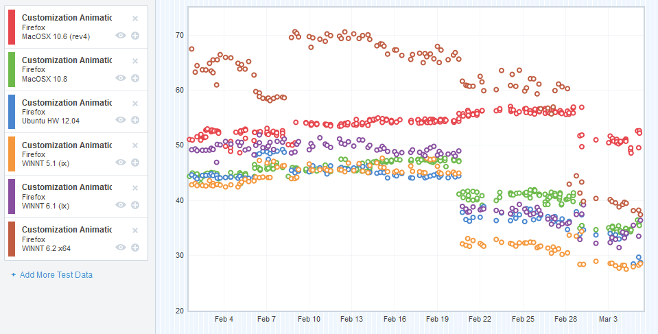
CART results - post-optimizations

CART results – post-optimizations

Those numbers are indeed lower!

Now, before you lose your mind about that epic cross-platform win around Feburary 20th, I investigated that changeset range and didn’t find anything we worked on directly in there.

There are some platform patches in there (specifically in Graphics) that might account for this win, but I’m pretty certain it’s because of bug 974621, which updated our test runners to use a different version of Talos that included the patch in bug 967186. 967186 altered the CART test to be more accurate in its measurements, so actually a lot of our initial data was erroneous. That blows a bit because it adds some unnecessary noise to our graph, but it’s also good because accuracy is a thing we definitely want.

Future work

I still think there’s more wins to be made in the customize mode transition. Finding a way of getting rid of the about:customizing preloading hack and replace it with something smarter (like a thin browser that doesn’t need to instantiate much of its backend, or no browser at all) is probably the first step. More profiling might find more wins. I’m learning more and more about platform as I work on Electrolysis, so maybe I’ll come back to this problem with some new skills and information, and I can get it performing reliably on all platforms as it really should: 60fps, smooth as silk.

Australis Performance Post-mortem Part 4: On Tab Animation

Whoops, forgot that I had a blog post series going on here where I talk about the stuff we did to make Australis blazing fast. In that time, we’ve shipped the thing (Firefox 29 represent!), so folks are actually feeling the results of this performance work, which is pretty excellent.

I ended the last post on an ominous note – something about how we were clear to land Australis on Nightly, or so we thought.

This next bit is all about timing.

There is a Performance Team at Mozilla, who are charged with making our products crazy-fast and crazy-smooth. These folks are geniuses at wringing out every last millisecond possible from a computation. It’s what they do all day long.

A pretty basic principle that I’ve learned over the years is that if you want to change something, you first have to develop a system for measuring the thing you’re trying to change. That way, you can determine if what you’re doing is actually changing things in the way you want them to.

If you’ve been reading this Australis Performance Post-mortem posts, you’ll know that we have some performance tests like this, and they’re called Talos tests.

Just about as we were finishing off the last of the t_paint and ts_paint regressions, the front-end team was suddenly made aware of a new Talos test that was being developed by the Performance team. This test was called TART, and stands for Tab Animation Regression Test. The purpose of this test is to exercise various tab animation scenarios and measure the time it takes to paint each frame and to proceed through the entire animation of a tab open and a tab close.

The good news was that this new test was almost ready for running on our Nightly builds!

The bad news was that the UX branch, which Australis was still on at the time, was regressing this test. And since we cannot land if we regress performance like this… it meant we couldn’t land.

Bad news indeed.

Or was it? At the time, the lot of us front-end engineers were groaning because we’d just slogged through a ton of other performance regressions. Investigating and fixing performance regressions is exhausting work, and we weren’t too jazzed that another regression had just shown up.

But thinking back, I’m somewhat glad this happened. The test showed that Australis was regressing tab animation performance, and tabs are opened every day by almost every Firefox user. Regressing tab performance is simply not a thing one does lightly. And this test caught us before we landed something that regressed those tabs mightily!

That was a good thing. We wouldn’t have known otherwise until people started complaining that their tabs were feeling sluggish when we released it (since most of us run pretty beefy development machines).

And so began the long process of investigating and fixing the TART regressions.

So how bad were things?

Let’s take a look at the UX branch in comparison with mozilla-central at the time that we heard about the TART regressions.

Here are the regressing platforms. I’ll start with Windows XP:

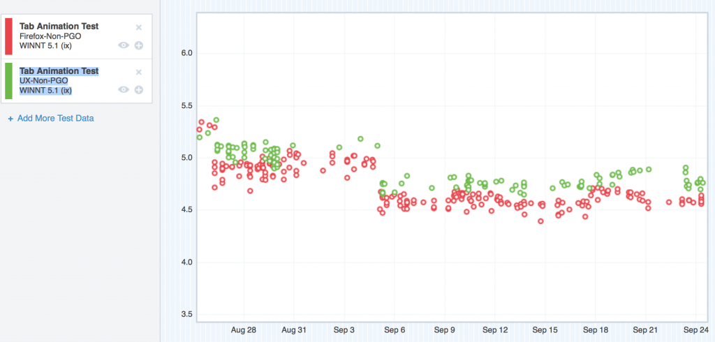
Where we started with TART on Windows XP

Where we started with TART on Windows XP

Forgive me, I couldn’t get the Graph Server to swap the colours of these two datasets, so my original silent pattern of “red is the regressor” has to be dropped. I could probably spend some time trying to swap the colours through various tricky methods, but I honestly don’t think anybody reading this will care too much.

So here we can see the TART scores for Windows XP, and the UX branch (green) is floating steadily over mozilla-central (red). Higher scores are bad. So here’s the regression.

Now let’s see OS X 10.6.

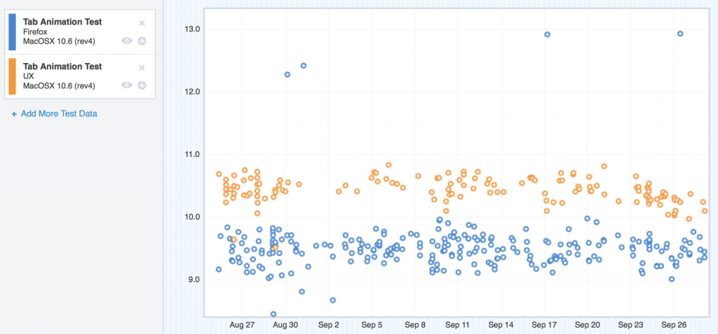
Where we started with TART on OS X 10.6

Where we started with TART on OS X 10.6

Same problem here – the UX nodes (tan) are clearly riding higher than mozilla-central. This was pretty similar to OS X 10.7 too, so I didn’t include the graph.

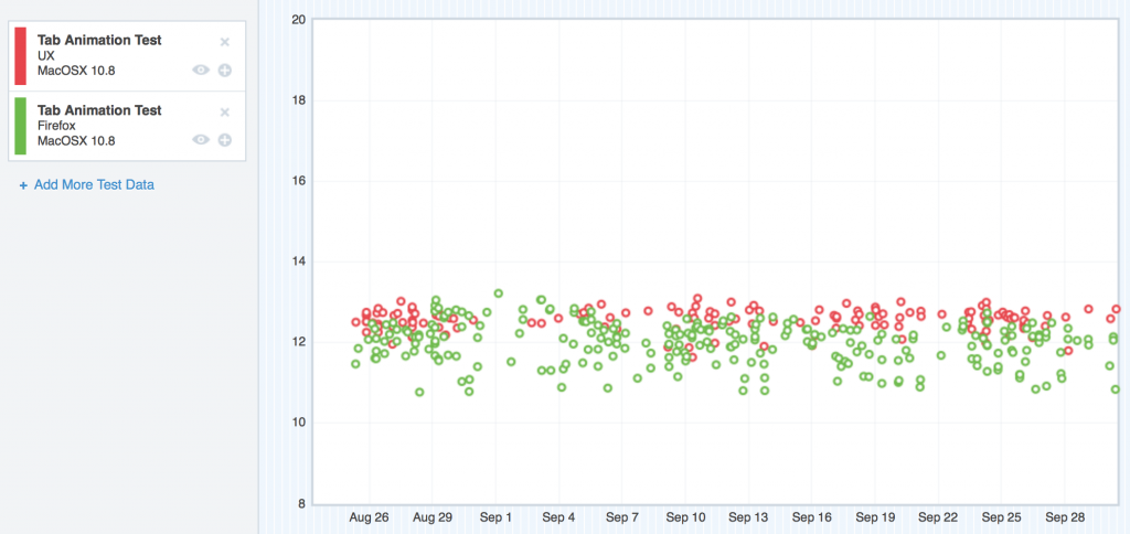
On OS X 10.8, things were a little bit better, but not too much:

Where we started with TART on OS X 10.8

Where we started with TART on OS X 10.8

Here, the regression was still easily visible, but not as large in magnitude.

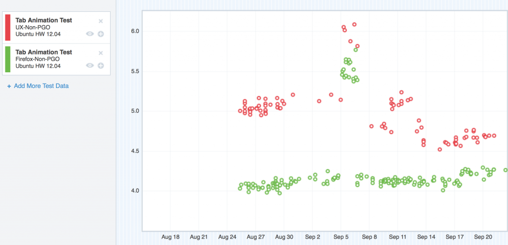
Ubuntu was in the same boat as OS X 10.6/10.7 and Windows XP:

Where we started with TART on Ubuntu

Where we started with TART on Ubuntu

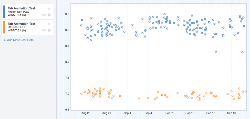
But what about Windows 7 and Windows 8? Well, interesting story – believe it or not, on those platforms, UX seemed to perform better than mozilla-central:

Windows 7 (the blue nodes are mozilla-central, the tan nodes are UX)

Where we started with TART on Windows 7

Where we started with TART on Windows 7

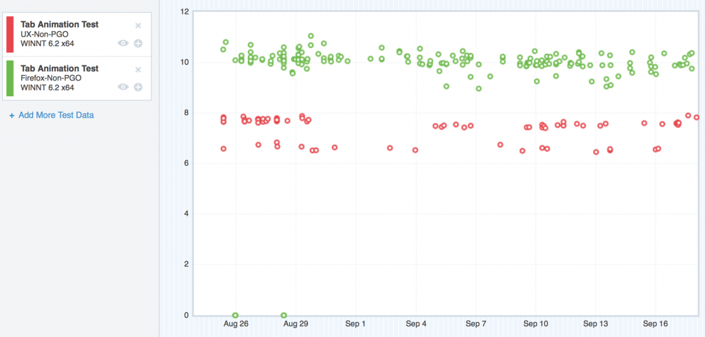
Windows 8 (the green nodes are mozilla-central, the red nodes are UX)

Where we started with TART on Windows 8

Where we started with TART on Windows 8

So what the hell was going on?

Well, we eventually figured it out. I’ll lay it out in the next few paragraphs. The following is my “rogue’s gallery” of regressions. This list does not include many false starts and red herrings that we followed during the months working on these regressions. Think of this as “getting to the good parts”.

Backfilling

The problem with having a new test, and having mozilla-central better than UX, is not knowing where UX got worse; there was no historical measurements that we could look at to see where the regression got introduced.

MattN, smart guy that he is, got us a few talos loaner machines, and wrote some scripts to download the Nightlies for both mozilla-central and UX going back to the point where UX split off. Then, he was able to run TART on these builds, and supply the results to his own custom graph server.

So basically, we were able to backfill our missing TART data, and that helped us find a few points of regression.

With that data, now it was time to focus in on each platform, and figure out what we could do with it.

Windows XP

We started with XP, since on the regressing platforms, that’s where most of our users are.

Here’s what we found and fixed:

Bug 916946 – Stop animating the back-button when enabling or disabling it.

During some of the TART tests, we start with single tab, open a new tab, and then close the new tab, and repeat. That first tab has some history, so the back button is enabled. The new tab has no history, so the back button is disabled.

Apparently, we had some CSS that was causing us to animate the back-button when we were flipping back and forth from the enabled / disabled states. That CSS got introduced in the patch that bound the back/forward/stop/reload buttons to the URL bar. It seemed to affect Windows only. Fixing that CSS gave us our first big win on Windows XP, and gave us more of a lead with Windows 7 and Windows 8!

Bug 907544 Pass the D3DSurface9 down into Cairo so that it can release the DC and LockRect to get at the bits

I don’t really remember how this one went down (and I don’t want to really spend the time swapping it back in by reading the bug), but from my notes it looks like the Graphics team identified this possible performance bottleneck when I showed them some profiles I gathered when running TART.

The good news on this one, was that it definitely gave the UX branch a win on Windows XP. The bad news is that it gave the same win to mozilla-central. This meant that while overall performance got better on Windows XP, we still had the same regression preventing us from landing.

Bug 919541 Consider not animating the opacity for Australis tabs

Jeff Muizelaar helped me figure this out while we were using paint flashing to analyze paint activity while opening and closing tabs. When we slowed down the transitions, we noticed that the closing tabs were causing paints even though they weren’t visible. Closing tabs aren’t visible because with Australis, we don’t show the tab shape around tabs when they’re not selected – and closing a tab automatically unselects it for something else.

For some reason, our layout and graphics code still wanted to paint this transition even though the element was not visible. We quickly nipped that in the bud, and got ourselves a nice win on tab close measurements for all platforms!

Bug 921038 – Move selected tab curve clip-paths into SVG-as-an-image so it is cached.

This was the final nail in the coffin for the TART regression on Windows XP. Before this bug, we were drawing the linear-gradients in the tab shape using CSS, and the clipping for the curve background colour was being pulled off using clip-path and an SVG curve defined in the browser.xul document.

In this bug, we moved from clipping a background to create the curve, to simply drawing a filled curve using SVG, and putting the linear-gradient for the texture in the “stroke” image (the image that overlays the border on the tab curve).

That by itself was not enough to win back the regression – but thankfully, Seth Fowler had been working on SVG caching, and with that cache backend, our patch here knocked the XP and Ubuntu regressions out! It also took out a chunk from OS X. Things were looking good!

OS X

Bug 924415 – Find out why setting chromemargin to 0,-1,-1,-1 is so expensive for TART on UX branch on OS X.

I don’t think I’ll ever forget this bug.

I had gotten my hands on a Mac Mini that (after some hardware modifications) matched the specs of our 10.6 Talos test machines. That would prove to be super useful, as I was easily able to reproduce the regression that machine, and we could debug and investigate locally, without having to remote in to some loaner device.

With this machine, it didn’t take us long to identify the drawing of the tabs in the titlebar as the main culprit in the OS X regression. But the “why” eluded us for weeks.

It was clear I wasn’t going to be able to solve it on my own, so Jeff Muizelaar from the Graphics team joined in to help me.

We looked at OpenGL profiles, we looked at apitraces, we looked at profiles using the Gecko Profiler, and we looked at profiles from Instruments – the profiler that comes included with XCode.

It seemed like the performance bottleneck was coming from the operating system, but we needed to prove it.

Jeff and I dug and dug. I remember going home one day, feeling pretty deflated by another day of getting nowhere with this bug, when as I was walking into my apartment, I got a phone call.

It was Jeff. He told me he’d found something rather interesting – when the titlebar of the browser overlapped the titlebar of another window, he was able to reproduce the regression. When it did not overlap, the regression went away.

Talos tests open a small window before they open any test browser windows. That little test window stays in the background, and is (from my understanding) a dispatch point for making talos tests occur. That little window has a titlebar, and when we opened new browser windows, the titlebars would overlap.

Jeff suggested I try modifying the TART test to move the browser approximately 22px (the height of a standard OS X titlebar) so that they would no longer overlap. I set that up, triggered a bunch of test runs, and went to bed.

I wasn’t able to sleep. Around 4AM, I got out of bed to look at the results – SUCCESS! The regression had gone away! Jeff was right!

I slept like a baby the rest of the night.

We closed this bug as a WONTFIX due to it being way outside our control.

Comment 31 and onward in that bug are the ones that describe our findings.

Eat it TART, your tears are delicious

Those were the big regressions we fixed for TART. It was a long haul, but we got there – and in the end, it means faster and smoother tab animation for our users, which means a better experience – and it’s totally worth it.

I’m particularly proud of the work we did here, and I’m also really happy with the cross-team support and collaboration we had – from Performance, to Layout, to Graphics, to Front-end – it was textbook teamwork.

Here’s an e-mail I wrote about us beating TART.

Where did we end up?

After the TART regression was fixed, we were set to land on mozilla-central! We didn’t just land a more beautiful browser, we also landed a more performant one.

Noice.

Stay tuned for Part 5 where I talk about CART.