Author Archives: Mike Conley

Australis Performance Post-mortem Part 1: Where We Started

Getting to the merge

Last Monday, November 18th, Australis merged into our Nightly release channel, meaning lots of people are getting to try it and give us feedback. It’s been an exciting week, and we’re all very pleased with the response so far!

Up until then, if you wanted to try Australis, you had to use the Nightlies from the UX branch. If you followed along on the UX branch, you’ll know that the tabs and the customization work have been in a pretty steady state for the last few months.

So what was the hold up? Why did it take so long to get to the merge?

Gather round folks, I have a story to tell.

Some terminology

I’m going to be batting around a few terms here, and some people will understand them right away, and some people won’t, so I’ll just spell them out here, in no particular order:

Australis
If at this point you’re still not sure what I mean by Australis, you might want to check out this blog post and the accompanying video.
mozilla-central
mozilla-central, in this instance, refers to code that did not have the Australis changes in them. In the grand scheme of things, mozilla-central was where non-Australis code went, and then we’d merge those changes into the UX branch.
UX branch
The UX branch was where we were storing all of the Australis code.
Talos
Talos is a series of tests that we can run against a build of Firefox to measure the performance of different things – for example, how long it takes for a window to be opened. As of this writing, Talos tests for Desktop Firefox are run on Ubuntu Linux 12.04, OS X (10.6, 10.7 and 10.8), and Windows (XP, 7 and 8).

Where we started from

Let’s rewind a bunch of months. Let’s go to about early June, 2013. At this time, the curvy tab work was essentially finished on Windows, and had been ported to OS X and Linux. The customization code was still being hacked on, but we felt like we were in a pretty decent place – the team felt like we were ready to merge into mozilla-central to get some real user feedback and testing.

The problem was that up until that point, we hadn’t been running the Talos tests on the UX Branch, which means we didn’t really have a good idea about how we were performing in comparison to mozilla-central.

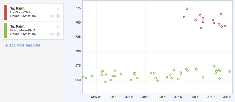
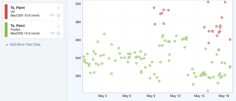
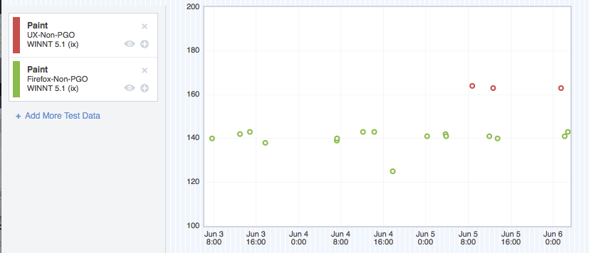
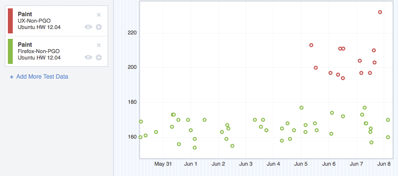
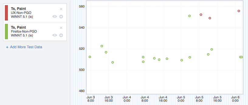
And then we turned the Talos tests on. Data started to flow in, and it wasn’t happy data. In particular, we were regressing pretty badly on two tests: ts_paint and tpaint.

ts_paint
this test measures how long it takes for Firefox to paint the first window on startup.
tpaint
this test measures how long it takes for Firefox to paint a newly opened window from a Firefox that is already running

Before I show you this data, I should clear some things up:  as mentioned above, we run these Talos tests on a bunch of operating systems, and a variety of operating system versions. I don’t want to bog this post down with too many charts, so I’m going to extract a chart for each operating system, and forgo breaking it down by operating system version. Suffice it to say that the regressions were pretty consistent from version to version.

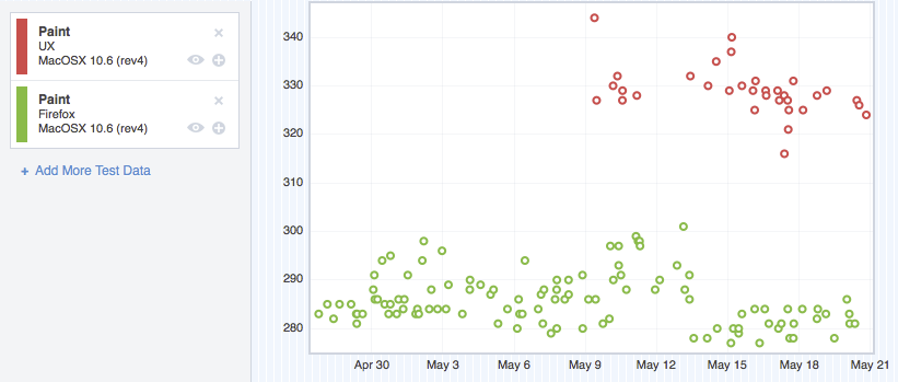
Also, in each of these graphs, green represents mozilla-central, and red represents the UX branch. Up is bad (slower). Down is good (faster).

Anyhow, here’s what we saw:

ts_paint

Windows XP - ts_paint regression

Windows XP – ts_paint regression

Linux 32 - ts_paint regression

Ubuntu 12.04 – ts_paint regression

OSX 10.6 - ts_paint regression

OSX 10.6 – ts_paint regression

tpaint

Windows XP - tpaint regression

Windows XP – tpaint regression

Linux 32 - tpaint regression

Ubuntu 12.04 – tpaint regression

OSX 10.6 - tpaint regression

OSX 10.6 – tpaint regression

Ouch

The team has been working like crazy to make Firefox look and feel faster. Hitting a regression like this blows.

It’s also flat out unacceptable to have a regression like this unless there’s a really really good reason for it.

So we had to investigate. What was making us slow? What had we done wrong?
Find out in Part 2.

ScummVM ported to HTML5?

This was just brought to my attention, and I’m pretty stoked! I haven’t actually looked at the source or done much in the way of investigation, but if it’s legit, then this is really, really exciting. 🙂

Maybe not as exciting as porting Unreal 3 to the web, but, well, I’m old-school. 😀

UPDATED: Thanks everybody for alerting me to the broken link. Fixed it now.

Downloading Stuff in Firefox – It’s Better Now

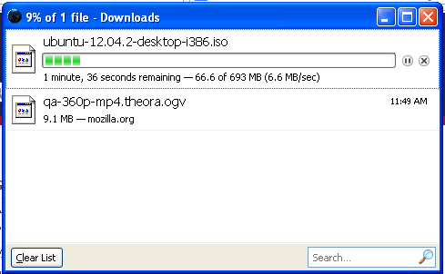
If you’ve ever downloaded anything using Firefox, you’ve probably seen this fellow:

A screenshot of the old downloads window

Early 2000’s baby, yeah!

This new window would pop up, and you could use it to manage and monitor your downloads.

There are a few problems with this new window:

  • You had to switch back and forth from it just to see how close your downloads were to being finished
  • It was easy to lose track of this window, especially when you had lots of windows open
  • The window listed every download you’d ever started, meaning that it got slower to render as the list got longer and longer.

This is just scratching the surface. Suffice it to say that the downloads window left much to be desired.

So, your friendly neighbourhood Firefox Desktop team have been working hard to make things a whole lot better.


The Downloads Button and Panel


Starting in Firefox 20 (released today!), a new button will be added to your toolbar:

A screenshot of the new downloads button in the Firefox toolbar

BEHOLD!

This button serves a number of purposes. For one thing, it tells you how long it will be until all of your downloads complete:

A screenshot of the progress meter in the downloads button

2 minutes until all of my downloads finish.

This button also animates when a download completes, and changes colour when all of your downloads are done:

The downloads button has changed colour to indicate that my downloads are ready.

Downloads are done!

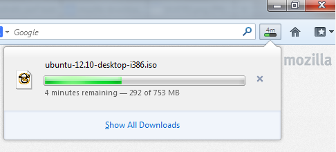
Clicking on the button will show you your latest downloads:

A screenshot of the downloads panel showing a single downloads progress.

Well, hello there.

And from here you can open your downloads easily. Not too shabby!

Like most things in Firefox, the new button can be moved to wherever you’d like it. Simply right click on your toolbar, and choose “Customize”, and drag the buttonto someplace new. Or, if you don’t want the button, you can drag it into the customize window to remove it completely (although, clearly you won’t be notified of downloads progress this way).


Manage your downloads in the Library


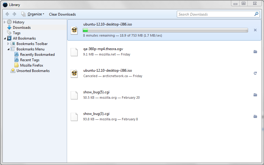
The downloads panel is a lightweight way to check the progress of your downloads. This is all well and good, but it doesn’t give us nearly the same power of the old downloads window. That’s why we have moved the functionality from the old downloads window into a new view in the Library.

The downloads window showing some finished downloads.

Getting a fresh copy of Ubuntu 12.10.

The new manager has similar functionality to the old one, so you can search your downloads, clear them and even leave this window open while closing any other browser windows to complete downloads in the background.

Since this unifies the concept of downloads and history, there is no more risk of clearing downloads for privacy reasons, only to find that your history had retained them!

You’ll also notice that with the new per-window Private Browsing feature, downloads are managed separately by each window – the downloads manager opens in a tab so that you can easily manage your private downloads.

The downloads tab in private-browsing mode.

Just some wholesome browsing going on here.

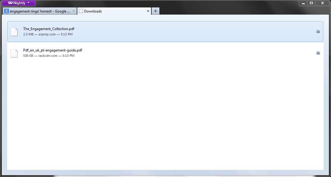
This way, we make absolutely sure that your private downloads do not show up in your history, while still giving you full control over those downloads. Engagement ring PDFs for everybody!


Some tips and tricks


There are some neat shortcuts from the old manager that some of you may have used. We tried to retain those and even make them better.

  • Pasting a url into the panel or the Library downloads view with CTRL-v will start a new download
  • You can drag downloads from the panel or the Library to the desktop or any other path
  • Related to this, you can download a PDF, and then drag it to the browser window to preview it using our built-in PDF viewer!
  • You can drag a link to the downloads button to start a new download
  • CTRL+j opens the Library directly in the Downloads section


Help us make it even better


If you find a bug in the new downloads experience, or you have enhancement requests for it, please file a bug in the Firefox / Downloads Panel component. You can also discuss the feature or your improvements ideas in the new firefox-dev mailing list.

On behalf of the team that helped make this thing happen (and folks, it’s been a long time coming), we hope you enjoy your new downloads experience in Firefox 20!

Code Spelunking – Australis Customization

Now that the Australis curvy tabs are in the polishing state, it’s time I turn my attention to the second part of Australis – the new customization experience.

Customizing Firefox’s UI has always been a little bit funky – you right click on a piece of chrome and choose Customize (or if you knew about it, go to View > Toolbars > Customize), and then a window pops up that lets you drag items to and from it. When this window is open, you are in the customizing state, so you can move buttons all over the place.

The new customization experience that the UX team has designed is quite a bit smoother. I can describe it, or, even better, I can show it to you.

Instructions:

  1. Go here to see bwinton’s awesome prototype
  2. Hide the main navigation bar for a more immersive experience (View > Toolbars > Navigation Toolbar)
  3. Click on the menu button in the right corner, and choose “Customize”
  4. WHOA
  5. Now drag some items from the customize palette onto the toolbar, or into your menu.

Pretty snazzy, and it does away with that old customize window, which is excellent.

Blair McBride has been working on this feature for a little while, but due to health issues, the project has been handed to Jared Wein and myself. And I suppose when Blair is back at 100%, it’ll be all three of us hacking on it. Or something like that.

So, everything I just wrote above? That was for you, to let you know what I’m looking at during my day. Everything below the “Notes to self…” header are my notes as I browse through the customization code as it is. Just going to jot down notes and observations, etc. You might find this interesting, since it will show you my thought process as I go.

Or you might think it’s just a confused and bewildered miasma of incoherent rambling and nonsense. Well, we’ll see how it goes.

Notes to self…

Glossary:

  • Panel – the thing that opens when I click on the three-line menu toolbar button (a.k.a “the hamburger” – sorry shorlander) in the nav-bar
  • Widget – what used to be considered “toolbarbuttons”. It’s a thing that can be in the panel, in the customize palette, or in a customizable toolbar
  • Customize palette – what used to be a new window is now an in-content selection of widgets you can chuck into the panel or customizable toolbars

So I know we’ve got ourselves a panel, and there’s a whole bunch of customization logic. There was also this API thing that Blair was working on so that add-ons could specify widgets through their chrome.manifests. And there also appears to be some work to be somewhat backwards compatible with the ol’ overlay approach to adding widgets.

The big mama seems to be browser/modules/CustomizableUI.jsm. This module seems to be responsible for a ton of stuff, including (but not limited to):

  • Panel open / closed state
  • Panel populating
  • Menu button pressed / unpressed state
  • Persisting and restoring customization settings
  • Catching “I dun get it” notifications from the chrome.manifest parser to see if it’s a widget that’s in there
    • Reading JARs or uncompressed files from the manifest to create widgets
  • Being the central hub of knowledge about where widgets are, and firing notifications when widgets are added, removed, moved or destroyed.
  • Knowing about which widgets are not being used, which lets us populate the palette tab when we enter customization mode
  • Allowing us to enter and exit the customization mode
    • That appears to be leftover cruft.  browser/modules/CustomizeMode.jsm seems to manage that now. I’ll remove the old cruft.

There’s this notion of “customizable areas” too. It looks like we’re constraining the customizable areas for now, and so we have an area between the URL bar and the menu button that we can drag and drop items to. The panel is also an area. When we enter customization mode…

Ok, this is pretty neat. When we enter customization mode, we suck out the panel, and drop it into a panel holder in the customization tab. That way, we can see the panel and add to it while customizing. Ok, I get that.

There was originally the idea of de-coupling the panel from the customization code. That might actually still be possible. I had tried that earlier, but was discouraged when I found out that the CustomizationUI.jsm was responsible for populating the contents of that menu panel too, meaning that the panel code itself was rather useless without the customization stuff. Maybe this needs more thought – because it would be nice to de-couple them a bit more.

Maybe I should work harder at de-coupling the menu stuff from the customization stuff – especially now that it looks like the panel is a little more complicated than just a widget drop point. Now widgets can have “subviews”, like the bookmarks widget. This means that stuff either slides out or moves over in the panel when clicking on a particular widget. Having all of that jammed up in CustomizableUI.jsm isn’t ideal – maybe I can split it out to help us separate our concerns a bit more.

Ok, I think I’ve convinced myself. I’m going to spend the rest of the afternoon trying to devise a strategy to de-couple these two.

Australis Curvy Tabs: More Progress!

I wrote a while back about how Matt, Avi Halachmi and I have been ironing out performance problems with the Australis curvy tabs.

Well, it looks like that work is finally paying off.

Our SVG usage seemed to be the big slow-poke, and switching to PNGs gave us the boost that we needed.

But enough squawking, let’s see some charts.

Before Optimizations

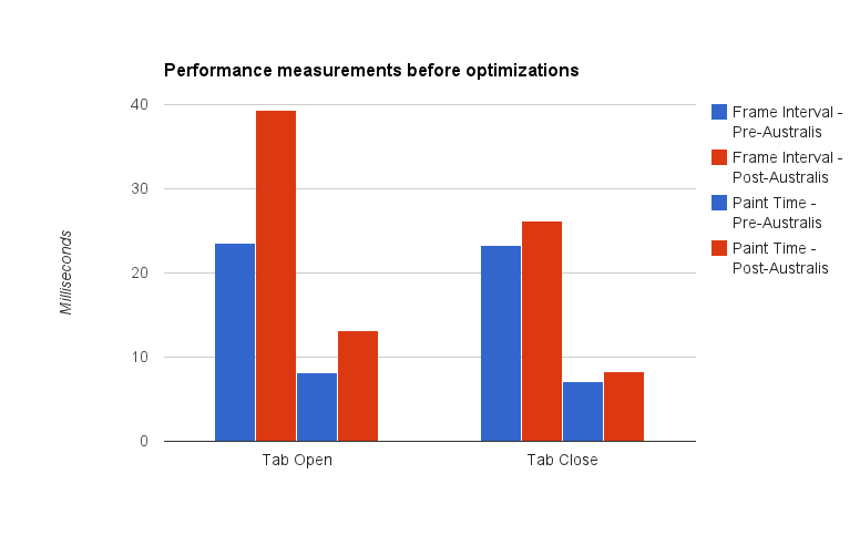
Let’s compare – here’s a chart showing the difference between pre-curves and post-curves, before our optimizations:

A graph showing Australis curves performance measurements before optimizations

Here’s the before shot

Note: it’s been a while since I’ve done data visualization work. I think the last time I did this was in grad school. So there might be way better ways of visualizing this data, but I just chose the easiest chart I could manage with Google Docs. Just go with it.

Let me describe what you’re seeing here – we take samples every time a tab opens, and every time a tab closes*. What we’re measuring is the interval time (how long it takes before we start drawing the next frame), and the paint time (how long it takes to actually draw a frame).

The blue bars represent the performance measurements we took on a build using the default theme.  The red bars represent the performance measurements we took using the Australis curvy tabs.

This is where my graph could probably be clearer – in each group of four bars, the left two represent interval times, and the right two represent paint times.

So, hand-wavey interpretation – we regressed in terms of performance in both painting, and frame intervals, for tab opening and closing.

So that’s what we started with. And then we did our optimizations. So where did we get to?

After Optimizations

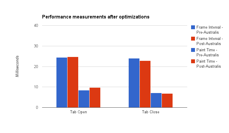
A graph showing Australis curves performance measurements after optimizations

Here’s the after shot!

The red bars shrunk, meaning that we got faster for both interval and paint times. In fact, for tab close, we beat the old theme! And we’re really super-close for tab open.

Pretty good!

Curvy tabs for all

Last night, Matt landed our optimization patches, as well as preliminary curvy tab work for OSX* and Linux GTK on our UX branch. So, if you’re on the UX branch (and why aren’t you?), you should be receiving a build soon with some curvy tabs. They’re not perfect, not by a long shot, but we’re getting into the polish stage now, which is good.

* Some notes on our measuring methodology. All tests were performed on a low-powered Acer Aspire One netbook. Intel Atom n450 processor (1.66Ghz), 1GB of RAM, running Windows 7. The device has no graphics acceleration support. We also switched to the classic theme to avoid glass. Avi wrote a patch that opened and closed a tab 15 times, and averaging the frame intervals and paint times for each frame. Those were averaged over the 15 openings and closings. We then ran that test 4 times, giving the machine time to “relax” in between, and averaged our results.

* We don’t have hi-dpi support yet, so if you’re on a Mac with a Retina display, your curves might be fuzzy. We’re working on it.