Australis Curvy Tabs: More Progress!

I wrote a while back about how Matt, Avi Halachmi and I have been ironing out performance problems with the Australis curvy tabs.

Well, it looks like that work is finally paying off.

Our SVG usage seemed to be the big slow-poke, and switching to PNGs gave us the boost that we needed.

But enough squawking, let’s see some charts.

Before Optimizations

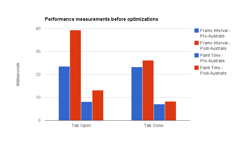
Let’s compare – here’s a chart showing the difference between pre-curves and post-curves, before our optimizations:

A graph showing Australis curves performance measurements before optimizations

Here’s the before shot

Note: it’s been a while since I’ve done data visualization work. I think the last time I did this was in grad school. So there might be way better ways of visualizing this data, but I just chose the easiest chart I could manage with Google Docs. Just go with it.

Let me describe what you’re seeing here – we take samples every time a tab opens, and every time a tab closes*. What we’re measuring is the interval time (how long it takes before we start drawing the next frame), and the paint time (how long it takes to actually draw a frame).

The blue bars represent the performance measurements we took on a build using the default theme.  The red bars represent the performance measurements we took using the Australis curvy tabs.

This is where my graph could probably be clearer – in each group of four bars, the left two represent interval times, and the right two represent paint times.

So, hand-wavey interpretation – we regressed in terms of performance in both painting, and frame intervals, for tab opening and closing.

So that’s what we started with. And then we did our optimizations. So where did we get to?

After Optimizations

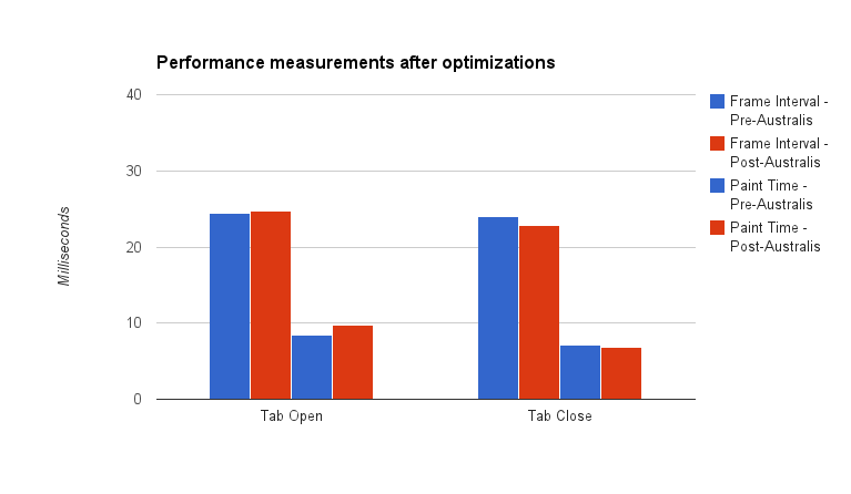
A graph showing Australis curves performance measurements after optimizations

Here’s the after shot!

The red bars shrunk, meaning that we got faster for both interval and paint times. In fact, for tab close, we beat the old theme! And we’re really super-close for tab open.

Pretty good!

Curvy tabs for all

Last night, Matt landed our optimization patches, as well as preliminary curvy tab work for OSX* and Linux GTK on our UX branch. So, if you’re on the UX branch (and why aren’t you?), you should be receiving a build soon with some curvy tabs. They’re not perfect, not by a long shot, but we’re getting into the polish stage now, which is good.

* Some notes on our measuring methodology. All tests were performed on a low-powered Acer Aspire One netbook. Intel Atom n450 processor (1.66Ghz), 1GB of RAM, running Windows 7. The device has no graphics acceleration support. We also switched to the classic theme to avoid glass. Avi wrote a patch that opened and closed a tab 15 times, and averaging the frame intervals and paint times for each frame. Those were averaged over the 15 openings and closings. We then ran that test 4 times, giving the machine time to “relax” in between, and averaged our results.

* We don’t have hi-dpi support yet, so if you’re on a Mac with a Retina display, your curves might be fuzzy. We’re working on it.
Making Australis Tab Animations Faster

The Firefox desktop team gathered in Toronto a few weeks back to hack together, and to discuss how we’re going to tackle 2013.

I can tell you right now, it’s going to be a fantastic year for Firefox.

Asa Dotzler has a great high-level write-up of some of the stuff we talked about, but I want to focus in on something Matt Noorenberghe and I were working on: beautiful curvy tabs.

An Australis tabs mockup

Mmmmm…that’s the stuff.

That’s what I’m talking about, right there.

These curvy-tabs are already available for Windows in the UX Nightly builds, and I’ve been using them for a few weeks. And they feel great. It’s actually painful to go back to the boxy, noisy, square tabs in the current default theme. Using the old boxy tabs feels like I’ve gone back in time – and not in a cool way.

Even Chrome’s 45° angle tabs feel just a little too machine-like and impersonal in comparison, in my opinion.

A screenshot of Google Chrome's tabstrip on OSX

Chrome’s 45° tabs

Having a more fluid and minimal tab strip in Firefox is great, but it’s only great if it performs well. Fluid and fast is the name of the game, and that’s what Matt and I were looking at; we were trying to find ways of speeding up tab opening and closing animations.

We’ve been working with the Performance Team on this, and we’ve been gathering some really interesting data. Probably the most interesting stuff is when we make a change that we expect to improve performance, and it doesn’t deliver. Or, even worse, it causes performance to be poorer. That’s usually a very surprising result.

We ran into such a result late last week, when we tried changing how we put a gradient on top of the selected and hovered tabs. We had originally been using the CSS linear-gradient function, and the Graphics Team told us that using a tiled background-image with some opacity (like a PNG) would improve performance.

Well, we generated our gradient as a PNG, tossed it in, and did our measurements. Lo and behold, performance worsened somewhat, and we’re still not exactly sure why. I’ve filed a bug on this, and I’m hoping we can get it resolved soon. Switching to PNGs for gradients was supposed to be an easy win, and the Graphics Team was pretty surprised by our result.

Matt and I tried a bunch of different ideas to speed up tab animations, and slowly but surely, the needle started to move in our favour. We’re getting close to matching the performance of the current square tabs, but we’re going to see if we can push it over the edge and bank ourselves an overall performance win.

Fluid is good, but fluid and fast is the best. We’re getting there.

Contact Service Connector Interface Proposal Draft

Thunderbird’s new address book will not exist in a vacuum. From the get-go, I’d like to bake-in the notion that contacts can exist outside of Thunderbird, and can be sync’d with.

There are lots of different contact providers I’d like to support. Mainly, CardDAV (which got a big boost since Google’s announcement), LDAP, the System Address Book, and Facebook.

I’ve been working on an interface (the application-programming kind – not the user kind) for contact provider connectors. It’s not been easy trying to generalize across each of the different features and requirements of these contact providers, but I think I got somewhere.

Anyhow, here’s a draft of my interface proposal. Are there any glaring holes?

Another update to the Ensemble UI Mockup

First of all, thanks for the great feedback on my mock-up from last week.

I’ve updated my mock-up again. Here are the highlights:

  • The contact tag selector has been decoupled from the search input, and is now on its own
  • Added widgets for sorting the contact list (currently only decorative)
  • Search queries can be cleared by clicking “X” on the search input
  • Support for semi-hierarchical tags
  • The contact list has been made wider
  • Moved the add / remove contact buttons

I’ve also updated the feedback form. Please give me feedback on this design. Once again, just to reiterate, at this point I’m primarily interested in how the mock-up lists contacts, and allows you to display that list. The view for individual contact details is of less interest to me right now.

Anyhow, check out the new mock-up here.

Usual disclaimer: The code is ugly as hell, and I haven’t tested outside of Firefox.

Note: Each tag should have some contacts. If you’re seeing empty tags (No search results for “”), try the following:

  1. Go here, and click refresh
  2. Then go here, and click refresh
  3. Then go here, hold down shift, and click refresh.

Don’t ask me why this happens, or why the above works. I think people.mozilla.org is doing some caching, and sometimes doesn’t realize that I update my stuff. Or maybe I’m doing my rsync all wrong. I have no idea.


Answering some questions about Ensemble

I keep getting great feedback from the Mozilla community, and I also get some pretty great questions.

I took the questions from this post, and formed them into an FAQ for the Ensemble project site. Answers included!

As more questions roll in, I’m going to try to keep that FAQ updated.