State of the current Thunderbird address book
While I was hacking away on my EDS Contacts Integration add-on, I got pretty familiar with the Thunderbird address book.
And as it stands, it’s adequate – but adequate like a pickle is adequate for dinner if it’s the only thing left in the fridge.
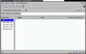
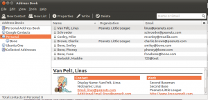
The address book interface hasn’t even really changed that much since it was part of Netscape Communicator. Check it out:
Before:

After:

Verdict: the Thunderbird address book is still stuck in the 90’s. It still assumes that your contacts only have one or two email addresses. It doesn’t have any notion of Twitter accounts, Facebook accounts, LinkedIn Profiles, or anything that we would associate with a modern online contact identity. It’s not flexible in the type and quantity of fields that can be associated with a contact.
We can do better.
Some designs I’ve been fiddling with
I should start by saying that the following are just ideas that I’ve been tossing around, and it’s still very very early in the design process. This is just a starting point. Feedback is encouraged!
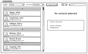
Ok, enough disclaimer. Here we go:

The first thing to notice is that the address book is now contained in a tab, as opposed to a separate pop-up window.
Next, notice that he tree of “address books” on the left is now gone. I always found it strange to open up the Thunderbird address book, and see that there were…address books inside of the address book. What I imagine instead is that the Thunderbird address book will know about “contact providers”, like Google Contacts, the OSX address book, the Evolution Data Server contacts database, etc. Thunderbird will copy all of those contacts locally for fast searching and processing, and synchronize changes both ways. It’ll also merge contacts that it realizes are the same person. (that’s a ton of work already…).
“But wait!”, I hear you cry. “I don’t want my Google Contacts to be mixed with the contacts from my OSX address book!”.
No problem – the new address book could have a notion of contact groups. Contacts imported from the OSX address book will belong to the OSX address book. Contacts imported from Google Contacts will belong to the Google Contacts group.
And contacts that were common between the two contact providers, and merged, will belong to both groups. Think of it like Google Plus’s Circles – a user can belong to one-or-several contact groups.
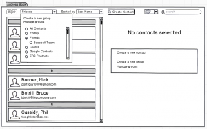
And if you want to view the contacts in a particular group, you could just choose that group from the contact group dropdown:

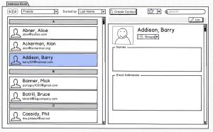
If we select a contact, we could view it like so:

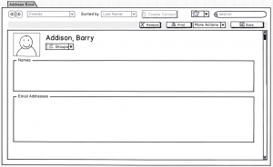
And then we could edit it by clicking the “Edit” button towards the top right:

When we’re editing a contact, the contact list slides away, and we get the full space of the address book to edit the contact. I haven’t exactly figured out what the various editing tools will look like on a contact (especially considering a merged contact where some elements of the contact exist in one contact provider, but cannot exist in another…ugh).
So one thing that we’re missing in that last screenshot is a “Cancel” button. Notice that we have those back/forward navigation buttons in the top left. I’m not sure if those are sufficient / clear enough for the job…but suppose the user could just click “back” to return to viewing the contact without having saved it.
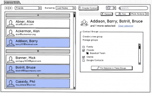
But what about selecting multiple contacts within the contact list? That might look like this:

So I’ve selected a few contacts here, and I can do various things with this selection – like removing the contacts from my address book, or printing them, etc. I can also assign these contacts to contact groups en masse.
Highlighting Barry Addison, Bruce Botrill and Phil Cassidy, I can see that all three belong to my “Friends” and “Clients” groups. Notice that the “Baseball Team” group checkbox looks a bit funny – it’s half filled in, which means that only some of my selection belongs to this group.
From here, I can just click on the various groups I want to assign these three contacts to. If I click on “Baseball Team”, the half-filled checkbox turns into a check – meaning that all of the contacts I’ve selected will be assigned to that group. Clicking it again would clear the check, meaning that all of the contacts I’ve selected will not be assigned to that group (and will be un-assigned if that already were assigned). And if I were to click that checkbox one more time, then it’d go back to it’s half-filled state, meaning that I’ll just keep the contacts that are assigned to “Baseball Team” where they are, and won’t add or remove any contacts from that group. It’s a tri-state checkbox. Kinda funky, but it’s my current solution.
Some other ideas worth mentioning:
Asynchronous
Currently, many operations conducted by the address book are synchronous, meaning that the user interface can feel sluggish while it’s waiting for certain events to occur (like writing contact data to a database). These events should really happen in the background so that the address book stays nice and snappy, and the user can go about their work.
Undo / Redo
This is a big one – any edit or delete events should be un-doable and re-doable. No exceptions.
So that’s what I’ve been thinking about.
Feedback?
