Tag Archives: ui

Whoops – I forgot I was a scientist

So yesterday I posted some mock-ups for a new Thunderbird address book design, and I got a bunch of really awesome, useful feedback.

Probably what rang out loudest for me was that I don’t really have any data on how real users actually use Thunderbird’s address book.  I know how I use it, but that’s about it.  In fact, I talked a Thunderbird user the other day who didn’t even know that the Thunderbird address book existed.  Go figure.

And here I went and jumped the gun, and tossed together some mock-ups.

If there’s anything that my grad supervisor Greg Wilson taught me, it’s not to jump to conclusions (or mock-ups) when we don’t have any data to back it up.  I’m a scientist, damn it, and that’s just how we roll.

Credit: http://cowbirdsinlove.com/46


Firefox has this great add-on called Test Pilot that lets Firefox users volunteer to have data periodically collected from them.  Work to get Test Pilot working for Thunderbird is underway, and I think that’d be an awesome tool for gathering feedback about how users use the address book.

Some questions I’d want answered, right off the top of my dome, in no particular order:

  1. Does anybody actually use Thunderbird’s address book?
  2. When someone is using the address book, what are they likely doing?
    1. Looking for a contact?
    2. Sorting and organizing their contacts?
    3. Creating or editing contacts?
    4. Other?
  3. Do people use mailing lists?  If so, how many do they tend to have?
  4. How many address books do people tend to have?
  5. How many address books do people want to have?
  6. How many contacts to people tend to have in their address books?
  7. Is it important for people to be able to group their contacts into sets, like “Family”, “Friends”, “Acquaintances”, “Employees”, “Co-workers”, etc?
  8. Given several address books, where each address book has some large number of contacts, how quickly can an individual contact be found?
  9. How much switching back and forth from mouse and keyboard is required to create a new contact, or to edit an old contact?
  10. How important is it for Thunderbird’s contacts to be synchronized with other contact services, like Google Contacts or the OSX address book?
    1. Or is it sufficient just to import them?
  11. How important is it for Thunderbird’s contacts to be synchronized with user’s mobile devices?
  12. On average, how long does it take to create a new contact?
  13. On average, how long does it take to edit a contact?
  14. On average, how much time are users spending in the address book?
  15. What fields do most users want to associate with a contact?
  16. What are the top 10 complaints about Thunderbird’s address book?
  17. What are the top 10 best things about Thunderbird’s address book?

What are some other questions I should try to get answered?

UPDATE (Aug 29 – 10:00EST)

I’ve gotten some awesome feedback on this post, and some new questions to add to my list.  Here they are, in no particular order:

  1. What is the main way in which Thunderbird users use and manipulate their address books?
    1. Through the main address book interface
    2. Through the contacts sidebar in the compose window
    3. Through the inline contact editor within a message header
    4. Other?
  2. If the answer to the above is anything other than 1, is it possible that the address book manager is not needed?  Or does not need to be as complicated as it already is?
  3. How many duplicate contacts does the average user possess (where a duplicate contact is a contact with the same e-mail address, or possibly the same name)
  4. How frustrating is it to add a contact in Thunderbird?
  5. How frustrating is it to edit a contact in Thunderbird?
  6. How frustrating is it to search for a contact in Thunderbird?
  7. How often do users want to create a contact based on a pre-existing one?  Example – creating co-workers, with similar fields for work addresses, etc, but different names, phones, etc.

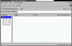
Fiddling with designs for a future Thunderbird address book

State of the current Thunderbird address book

While I was hacking away on my EDS Contacts Integration add-on, I got pretty familiar with the Thunderbird address book.

And as it stands, it’s adequate – but adequate like a pickle is adequate for dinner if it’s the only thing left in the fridge.

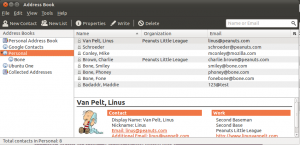
The address book interface hasn’t even really changed that much since it was part of Netscape Communicator.  Check it out:

Before:

Here's a screenshot of the address book from Netscape Communicator

After:

Here's a shot of the Thunderbird address book on Ubuntu Oneiric

Verdict: the Thunderbird address book is still stuck in the 90’s.  It still assumes that your contacts only have one or two email addresses.  It doesn’t have any notion of Twitter accounts, Facebook accounts, LinkedIn Profiles, or anything that we would associate with a modern online contact identity.  It’s not flexible in the type and quantity of fields that can be associated with a contact.

We can do better.

Some designs I’ve been fiddling with

I should start by saying that the following are just ideas that I’ve been tossing around, and it’s still very very early in the design process.  This is just a starting point. Feedback is encouraged!

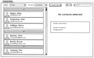
Ok, enough disclaimer.  Here we go:

The first thing to notice is that the address book is now contained in a tab, as opposed to a separate pop-up window.

Next, notice that he tree of “address books” on the left is now gone.  I always found it strange to open up the Thunderbird address book, and see that there were…address books inside of the address book.  What I imagine instead is that the Thunderbird address book will know about “contact providers”, like Google Contacts, the OSX address book, the Evolution Data Server contacts database, etc.  Thunderbird will copy all of those contacts locally for fast searching and processing, and synchronize changes both ways.  It’ll also merge contacts that it realizes are the same person. (that’s a ton of work already…).

“But wait!”, I hear you cry.  “I don’t want my Google Contacts to be mixed with the contacts from my OSX address book!”.

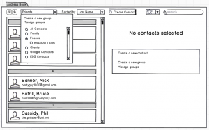
No problem – the new address book could have a notion of contact groups.  Contacts imported from the OSX address book will belong to the OSX address book.  Contacts imported from Google Contacts will belong to the Google Contacts group.

And contacts that were common between the two contact providers, and merged, will belong to both groups.  Think of it like Google Plus’s Circles – a user can belong to one-or-several contact groups.

And if you want to view the contacts in a particular group, you could just choose that group from the contact group dropdown:

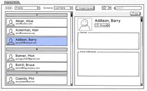
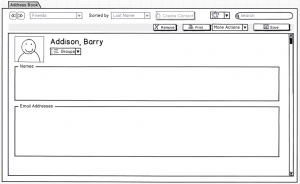
If we select a contact, we could view it like so:


And then we could edit it by clicking the “Edit” button towards the top right:

When we’re editing a contact, the contact list slides away, and we get the full space of the address book to edit the contact.  I haven’t exactly figured out what the various editing tools will look like on a contact (especially considering a merged contact where some elements of the contact exist in one contact provider, but cannot exist in another…ugh).

So one thing that we’re missing in that last screenshot is a “Cancel” button.  Notice that we have those back/forward navigation buttons in the top left.  I’m not sure if those are sufficient / clear enough for the job…but suppose the user could just click “back” to return to viewing the contact without having saved it.

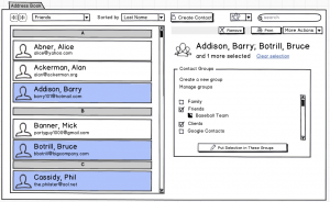
But what about selecting multiple contacts within the contact list?  That might look like this:

So I’ve selected a few contacts here, and I can do various things with this selection – like removing the contacts from my address book, or printing them, etc.  I can also assign these contacts to contact groups en masse.

Highlighting Barry Addison, Bruce Botrill and Phil Cassidy, I can see that all three belong to my “Friends” and “Clients” groups.  Notice that the “Baseball Team” group checkbox looks a bit funny – it’s half filled in, which means that only some of my selection belongs to this group.

From here, I can just click on the various groups I want to assign these three contacts to.  If I click on “Baseball Team”, the half-filled checkbox turns into a check – meaning that all of the contacts I’ve selected will be assigned to that group.  Clicking it again would clear the check, meaning that all of the contacts I’ve selected will not be assigned to that group (and will be un-assigned if that already were assigned).  And if I were to click that checkbox one more time, then it’d go back to it’s half-filled state, meaning that I’ll just keep the contacts that are assigned to “Baseball Team” where they are, and won’t add or remove any contacts from that group.  It’s a tri-state checkbox.  Kinda funky, but it’s my current solution.

Some other ideas worth mentioning:

Asynchronous

Currently, many operations conducted by the address book are synchronous, meaning that the user interface can feel sluggish while it’s waiting for certain events to occur (like writing contact data to a database).  These events should really happen in the background so that the address book stays nice and snappy, and the user can go about their work.

Undo / Redo

This is a big one – any edit or delete events should be un-doable and re-doable.  No exceptions.

So that’s what I’ve been thinking about.

Feedback?

Filing Defects in Review Board

In my last post, I talked about an extension for Review Board that would allow users to register “defects”, “TODOs” or “problems” with code that’s up for review.

After chatting with the lead RB devs for a bit, we’ve decided to scrap the extension.

[audible gasp, booing, hissing]

Instead, we’re just going to put it in the core of Review Board.

[thundering applause]

Defects

Why is this useful?  I’ve got a few reasons for you:

  1. It’ll be easier for reviewees to keep track of things left to fix, and similarly, it’ll be harder for reviewees to accidentally skip over fixing a defect that a reviewer has found
  2. My statistics extension will be able to calculate useful things like defect detection rate, and defect density
  3. Maybe it’s just me, but checking things off as “fixed” or “completed” is really satisfying
  4. Who knows, down the line, I might code up an extension that lets you turn finding/closing defects into a game

However, since we’re adding this to the core of Review Board, we have to keep it simple.  One of Review Board’s biggest strengths is in its total lack of clutter.  No bells.  No whistles.  Just the things you need to get the job done.  Let the extensions bring the bells and whistles.

So that means creating a bare-bones defect-tracking mechanism and UI, and leaving it open for extension.  Because who knows, maybe there are some people out there who want to customize what kind of defects they’re filing.

I’ve come up with a design that I think is pretty simple and clean.  And it doesn’t rock the boat – if you’re not interested in filing defects, your Review Board experience stays the same.

Filing a Defect

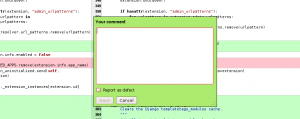
I propose adding a simple checkbox to the comment dialog to indicate that this comment files a defect, like so:

Comment Defect Checkbox Screenshot

No bells. No whistles. Just a simple little checkbox.

While I’m in there, I’ll try to toss in some hooks so that extension developers can add more fields – for example, the classification or the priority of the defect.  By default, however, it’s just a bare-bones little checkbox.

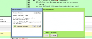
So far, so good.  You’ve filed a defect.  Maybe this is how it’ll look like in the in-line comment viewer:

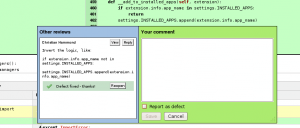
The inline comment viewer is showing that a defect report has been filed.

A defect has been reported!

Two Choices

A reviewer can file defects reports, and the reviewee is able to act on them.

Lets say I’m the reviewee.  I’ve just gotten a review, and I’ve got my editor / IDE with my patch waiting in the background.  I see a few defect reports have been filed.  For the ones I completely agree with, I fix them in my editor, and then go back to Review Board and mark them as Fixed.

The defect report has been marked as being fixed.

All fixed!

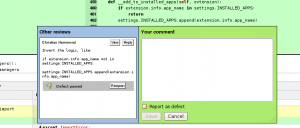
It’s also possible that I might not agree with one or more of the defect reports.  In this case, I’ll reply to the comment to argue my case.  I might also mark the defect report as Pass, which means, “I’ve seen it, but I think I’ll pass on that”.

The defect report has been marked as "pass".

I think I'll pass on that, thanks.

These comments and defect reports are also visible in the review request details page:

A defect report has been filed, and we're in the review request detail page.

A defect has been filed.

The defect is marked as fixed, and we're in the review request detail page.

All fixed up.

We're passing on the defect report, and we're in the review request detail page.

It's all good - just pass this defect report.

Thoughts?

What do you think?  Am I on the right track?  Am I missing a case?  Does “pass” make sense?  Will this be useful?  I’d love to hear your thoughts.